I posted last year on how to adapt a stack view to regular or compact size classes. The combination of stack views and Interface Builder simplifies the task and makes it easy to preview layouts for different size classes. But what if you are not using stack views? What if you are not using Interface Builder - either by choice or because you can only create the layout in code?
This post looks at how to use auto layout with size classes when you need to do it with code.
The Problem
I want to layout two buttons using equal spacing. I can do that in code with layout guides as I explained in this earlier post. The appearance on an iPhone 6S Plus in landscape (regular width) is below:
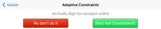
The problem is that my button titles are so long that this layout will not work in compact width. The long button title gets shortened when we rotate the device to portrait:

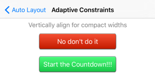
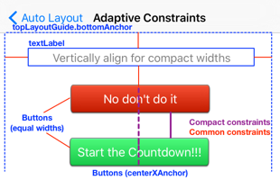
We can solve this layout problem by arranging the buttons vertically when we have a compact width:
Creating the Constraints
To achieve this adaptive layout we need two sets of constraints. For a regular width size class we want to arrange our buttons horizontally. For a compact width size class we want them to be vertical. We can setup both sets of constraints from the viewDidLoad method of our view controller:
override func viewDidLoad() {
  super.viewDidLoad()
  setupViews()
  setupConstraints()
}
I will skip the creation of the text label and buttons. You can take a look at the sample code if you want the details. More interesting is the setup of the constraints. Looking at the two layouts we want to achieve you can divide the constraints into three groups:
- Common Constraints used by both layouts
- Regular Width Constraints
- Compact Width Constraints
We can add all these constraints in viewDidLoad but we should only activate the regular or compact width constraints based on the size class.
Common Constraints
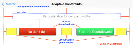
We first create and activate the constraints common to both size classes. I find the easiest way to do that is create the two layouts independently and then extract the common constraints.
We want the text label to always be below the top layout guide and between the readable content guide:
private func setupConstraints() {
  let contentGuide = view.readableContentGuide
  textLabel.leadingAnchor.constraintEqualToAnchor(contentGuide.leadingAnchor).active = true
  textLabel.trailingAnchor.constraintEqualToAnchor(contentGuide.trailingAnchor).active = true
  textLabel.topAnchor.constraintEqualToAnchor(topLayoutGuide.bottomAnchor, constant: 8.0).active = true
The red button is always spaced just below the text label and the width of the two buttons is always the same:
  redButton.topAnchor.constraintEqualToAnchor(textLabel.bottomAnchor, constant: 8.0).active = true
  redButton.widthAnchor.constraintEqualToAnchor(greenButton.widthAnchor).active = true
Finally we can add some of the constraints for the layout guides. You can read the earlier post for the details on how to use these to space the buttons:
  leadingGuide.widthAnchor.constraintEqualToAnchor(middleGuide.widthAnchor).active = true
  leadingGuide.widthAnchor.constraintEqualToAnchor(trailingGuide.widthAnchor).active = true

  view.leadingAnchor.constraintEqualToAnchor(leadingGuide.leadingAnchor).active = true
  trailingGuide.trailingAnchor.constraintEqualToAnchor(view.trailingAnchor).active = true
Since a picture is worth a thousand words here are the common constraints shown in red:
Regular Width Constraints
The regular width constraints should only be active when we have a regular horizontal size class. To be able to activate and deactivate these constraints we need to keep a reference to them. I have an empty array of NSLayoutConstraint elements for that purpose:
var regularConstraints = [NSLayoutConstraint]()
Now as we create each constraint we add it to the array for future reference. Note that, unlike the common constraints, we are not yet activating any of these constraints:
The first four constraints work from left to right setting up the constraints between the layout guides and the two buttons to create a horizontal layout:
regularConstraints.append(leadingGuide.trailingAnchor.constraintEqualToAnchor(redButton.leadingAnchor))
regularConstraints.append(redButton.trailingAnchor.constraintEqualToAnchor(middleGuide.leadingAnchor))
regularConstraints.append(middleGuide.trailingAnchor.constraintEqualToAnchor(greenButton.leadingAnchor))
regularConstraints.append(greenButton.trailingAnchor.constraintEqualToAnchor(trailingGuide.leadingAnchor))
Finally we constrain the green button to just below the text label:
regularConstraints.append(greenButton.topAnchor.constraintEqualToAnchor(textLabel.bottomAnchor, constant: 8.0))
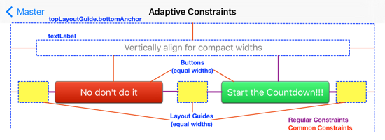
Here are the regular constraints in purple added to the red common constraints to fully define our regular size class layout:
Compact Width Constraints
The compact width constraints should only be active when we have a compact horizontal size class (e.g. an iPhone in portrait orientation). As with the regular width constraints we need an array to store these constraints as we create them:
var compactConstraints = [NSLayoutConstraint]()
In the vertical arrangement we need constraints to center both buttons in the superview:
compactConstraints.append(redButton.centerXAnchor.constraintEqualToAnchor(view.centerXAnchor))
compactConstraints.append(greenButton.centerXAnchor.constraintEqualToAnchor(view.centerXAnchor))
We also constrain the green button so that it is below the red button:
compactConstraints.append(greenButton.topAnchor.constraintEqualToAnchor(redButton.bottomAnchor, constant: 8.0))
Again note that none of these constraints are yet active. Here are the compact constraints in purple added to the red common constraints to fully define our compact size class layout:
Activating a Collection of Constraints
Now that we have both sets of constraints added to our views we need to activate the size class specific constraints. Let’s create a helper function which takes the horizontal size class and then activates/deactivates the two groups of constraints:
private func enableConstraintsForWidth(horizontalSizeClass: UIUserInterfaceSizeClass) {
  if horizontalSizeClass == .Regular {
    NSLayoutConstraint.deactivateConstraints(compactConstraints)
    NSLayoutConstraint.activateConstraints(regularConstraints)
  } else {
    NSLayoutConstraint.deactivateConstraints(regularConstraints)
    NSLayoutConstraint.activateConstraints(compactConstraints)
  }
}
If we have a regular horizontal size class we only want the regular constraints active. If we have anything else (compact or unspecified) we do the reverse and only have the compact constraints active. Note that we make use of two convenience class methods of NSLayoutConstraint to activate or deactivate the array of constraints with one call.
We can use this from our setupConstraints function to activate the initial set of constraints. The view controller has a traitCollection property which will tell us the horizontal size class to use:
private func setupConstraints() {
  ...
  enableConstraintsForWidth(traitCollection.horizontalSizeClass)
}
Responding to Size Class Changes
To make our view controller responsive to size class changes we need to override traitCollectionDidChange:
override func traitCollectionDidChange(previousTraitCollection: UITraitCollection?) {
  super.traitCollectionDidChange(previousTraitCollection)
  if traitCollection.horizontalSizeClass != previousTraitCollection?.horizontalSizeClass {
    enableConstraintsForWidth(traitCollection.horizontalSizeClass)
  }
}
After making sure to call super we check if the trait that changed was the horizontal size class. If it was we call our helper function with the new size class to adjust our constraints.
Sample Code
You can find the full working examples from this post in the AutoLayout Xcode project in my GitHub Code Examples repository.