Apple introduced the concept of adaptive user interfaces in iOS 8 relying on a combination of Auto Layout and size classes. Building user interfaces that adapt to changes in size class became even more important when Apple added slide over and split screen support in iOS 9.
The problem is that I can never remember which devices support which size class in which orientation (landscape or portrait). The added slide over and split screen combinations don’t make it any easier. Finding where Apple describes the details is tricky so after a few minutes with OmniGraffle here, for future reference, is my guide:
Last updated: May 19, 2021
Size Classes
There are two size classes that can apply to the horizontal (width) or vertical (height) dimension of an application interface:
- regular: meaning your interface has lots of space.
- compact: meaning your interface has only limited space.
iPhone Plus and Max Models
The larger iPhone Plus and Max models have a regular width in landscape orientation. The longest dimension is always regular and the shortest dimension is always compact.
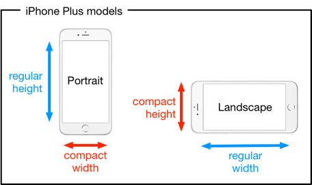
The full list of iPhone models with a regular width in landscape:
- iPhone 12 Pro Max
- iPhone 11 XS Max, iPhone 11 Pro Max
- iPhone XR, iPhone 11
- iPhone 7 Plus, iPhone 8 Plus
- iPhone 6 Plus, iPhone 6S Plus
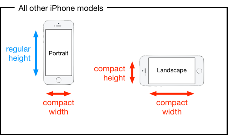
All Other iPhone Models
The other, smaller, iPhone models have a trickier set of size classes to remember. The longest dimension of the device is regular in portrait but only compact in landscape.
iPad Full Screen
A full screen iPad application always has regular height and regular width size classes regardless of orientation or device.
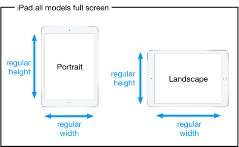
Note that there is no difference in size class between the largest iPad Pro and the smallest iPad Mini when the application is full screen.
iPad Split Screen and Slide Over
The multi-tasking views introduced in iOS 9 complicate the situation for the iPad. For the first time an iPad application can find it itself running with a compact horizontal size class. Another assumption that no longer holds is that the window and screen bounds will always be the same. I cover the details in an earlier post on iOS 9 slide over and split view.
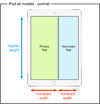
iPad all models portrait
In portrait orientation a user cannot change the position of the split screen (or slide over). The primary application is slightly wider than the secondary application but both have a compact width size class.
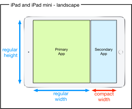
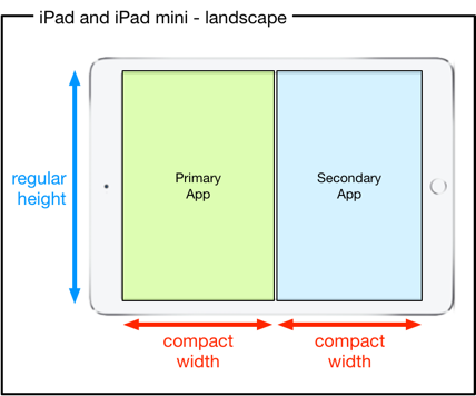
iPad landscape
In landscape orientation a user can choose between two different positions for the split screen (regular/compact or compact/compact).
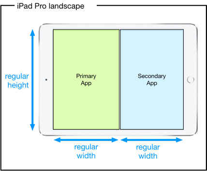
iPad Pro 12.9-inch landscape
The iPad Pro 12.9-inch model differs from the smaller iPads in landscape. When the screen is evenly split both applications have a regular horizontal size class.