Create your own custom SwiftUI view modifier when you want to reuse a set of modifiers on multiple views. Removing duplication also cleans up and improves the readability of your SwiftUI views.
Here’s my starting point. A SwiftUI view that contains two text views with some styling applied:
struct CountryView: View {
  let country: Country

  var body: some View {
    VStack(alignment: .leading, spacing: 4) {
      Text(country.name)
        .font(.headline)
        .padding([.leading,.trailing], 5)
        .background(Color(.secondarySystemBackground))
        .cornerRadius(5.0)

      Text(country.formattedPopulation)
        .font(.caption)
        .padding([.leading,.trailing], 5)
        .background(Color(.secondarySystemBackground))
        .cornerRadius(5.0)
    }
  }
}
Here’s how it looks when previewed in light and dark modes:
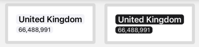
There’s a lot of repetition in my view. The two text views each have the same four view modifiers to set the font (albeit a different font), background, padding and corner radius. We can clean this up by combining those four modifiers into our own custom modifier that we can then apply to any view.
What Is A View Modifier?
A ViewModifier takes a view, modifies it in some way and returns the result. As we’ve already seen you can concatenate a chain of modifiers to build a final view. To create our own custom view modifier we adopt the ViewModifier protocol in our own type.
Here’s my first go at creating a Caption view modifier:
// Caption.swift
import SwiftUI

struct Caption: ViewModifier {
  func body(content: Content) -> some View {
    content
      .font(.caption)
      .padding([.leading,.trailing], 5)
      .background(Color(.secondarySystemBackground))
      .cornerRadius(5.0)
  }
}
There’s only one requirement, to implement the body method that accepts some content and returns a view. I copied the modifiers from the country view, applying them to the content. We’ll see how to customize the font in a moment.
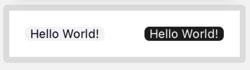
We could apply our Caption modifier to a view using modifier(_:):
Text("Hello World!")
  .modifier(Caption())
That’s a bit ugly. A better way is to add our custom modifier as an extension on View:
extension View {
  func caption() -> some View {
    modifier(Caption())
  }
}
We can now apply our modifier directly like the standard SwiftUI modifiers:
Text("Hello World!")
  .caption()
Adding Parameters
My caption modifier always uses a .caption font but in my original view I also used a .headline font. Let’s give my Caption struct a font property and use it to set the font in the body. Let’s also make the color configurable at the same time:
struct Caption: ViewModifier {
  let font: Font
  let backgroundColor: Color

  func body(content: Content) -> some View {
    content
      .font(font)
      .padding([.leading,.trailing], 5.0)
      .background(backgroundColor)
      .cornerRadius(5.0)
  }
}
We need to update our view extension to set the font and color when creating a new Caption. I’ve used this opportunity to set some defaults:
extension View {
  func caption(font: Font = .caption,
    backgroundColor: Color = Color(.secondarySystemBackground))
    -> some View {
      modifier(Caption(font: font,
            backgroundColor: backgroundColor))
  }
}
We can now override the default caption font and background color when we apply the modifier. My original country view using the caption modifier:
struct CountryView: View {
  let country: Country

  var body: some View {
    VStack(alignment: .leading, spacing: 4) {
      Text(country.name)
        .caption(font: .headline)

      Text(country.formattedPopulation)
        .caption()
    }
  }
}
Note that our modifier works with other views, and modifiers, not just Text:
Image(systemName: "person.fill")
  .foregroundColor(.green)
  .caption(font: .largeTitle)

Adding To The Xcode Library
For bonus points, we can add our view modifier to the Xcode Library:
@available(iOS 14.0, *)
struct ModifierLibrary: LibraryContentProvider {
  @LibraryContentBuilder
  func modifiers(base: Text) -> [LibraryItem] {
    LibraryItem(base.caption(), category: .effect)
  }
}
Adding To A Swift Package
View modifiers are a great candidate for inclusion in a Swift package either to share between targets in a project or for reuse across projects. Often that needs no more than marking the view extension with public. My final packaged version:
// Caption.swift
import SwiftUI

struct Caption: ViewModifier {
  let font: Font
  let backgroundColor: Color

  func body(content: Content) -> some View {
    content
      .font(font)
      .padding([.leading, .trailing], 5.0)
      .background(backgroundColor)
      .cornerRadius(5.0)
  }
}

extension View {
  /// Place this view in a filled, rounded rectangle.
  /// - Parameters:
  ///   - font: Font applied to view. Default: `.caption`
  ///   - backgroundColor: Background color of view.
  ///     Default: `.secondarySystemBackground`
  public func caption(font: Font = .caption,
           backgroundColor: Color = Color(.secondarySystemBackground))
    -> some View {
    modifier(Caption(font: font,
          backgroundColor: backgroundColor))
  }
}

@available(iOS 14.0, *)
struct ModifierLibrary: LibraryContentProvider {
  @LibraryContentBuilder
  func modifiers(base: Text) -> [LibraryItem] {
    LibraryItem(base.caption(), category: .effect)
  }
}
See Add resources to Swift packages if your view modifier needs an asset catalog or other resources added to the package.