Many macOS apps support customizing the toolbar by adding, removing and rearranging the available items. In iOS 16, Apple brought this feature to the iPad.
Toolbar Placement
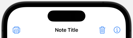
When you add items to a navigation toolbar you can choose semantic placements such as the primary action or explicit placements like the leading or trailing edge. For example, a toolbar with a leading item and two primary actions:
ContentView()
  .navigationTitle(item.title)
  .navigationBarTitleDisplayMode(.inline)
  .toolbar {
    ToolbarItem(placement: .navigationBarLeading) {
      printButton
    }
    ToolbarItemGroup(placement: .primaryAction) {
      deleteButton
      editButton
    }
  }
The system decides how to handle semantic placements depending on the intent, context, and platform. Primary actions are the most commonly used actions. On iOS, iPadOS, and tvOS, the system puts them on the trailing edge of the navigation bar. On macOS, the primary action appears on the leading edge.
Secondary Actions
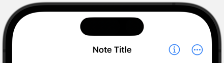
In iOS 16, Apple added a placement for secondary actions that are less commonly used:
.toolbar {
  ToolbarItem(placement: .primaryAction) {
    editButton
  }
  ToolbarItemGroup(placement: .secondaryAction) {
    shareButton
    faveButton
    printButton
    deleteButton
  }
}
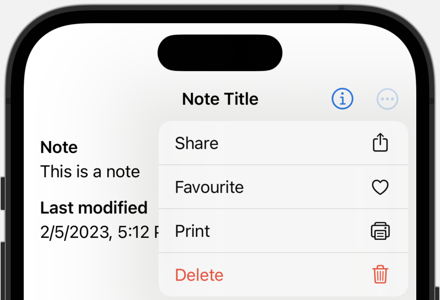
On the iPhone a secondary action does not appear in the toolbar:
The user only sees these secondary actions when they open the overflow menu:
Toolbar Roles
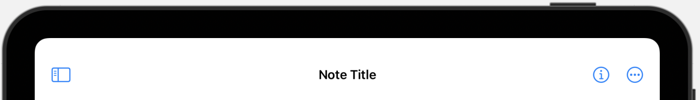
On the iPhone, with limited space, secondary actions live in the overflow menu. On the iPad we can do better by providing a toolbar role. There are three possible roles:
browser- for content where the user navigates backwards and forwards.editor- for editing document-like content.navigationStack- for content you push and pop.
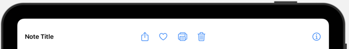
The default automatic role switches to navigationStack on iOS and editor role on macOS. The browser and editor roles both move the title from the center to the leading edge creating more space for toolbar items. For example, here’s my toolbar running on the iPad with the default navigation stack role and overflow menu:
Adding the .editor toolbar role:
.toolbar { ... }
.toolbarRole(.editor)
The title moves from the center to the leading edge making room to move the secondary items out from the overflow menu:
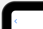
The only difference I can see between the browser and editor roles is what happens to the back button:
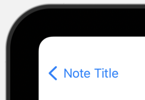
In the editor role, if you have a back navigation button, the editor role removes the title from the button:
Note the toolbar role doesn’t change the iPhone toolbar.
Customizable Toolbar
The Apple Human Interface Guidelines suggest iPadOS and macOS apps let users customize the toolbar. There are a couple of pre-requisites to make that work:
- Split any toolbar item groups into individual items.
- Give every toolbar item and the toolbar itself a unique identifier.
First we need to split the toolbar item group that contains the secondary actions into separate items:
.toolbar {
  ToolbarItem(placement: .primaryAction) { editButton }
  ToolbarItem(placement: .secondaryAction) { shareButton }
  ToolbarItem(placement: .secondaryAction) { faveButton }
  ToolbarItem(placement: .secondaryAction) { printButton }
  ToolbarItem(placement: .secondaryAction) { deleteButton }
}
.toolbarRole(.editor)
Then add a unique identifier to each item and the toolbar. The system uses the identifier to save and restore the user customization:
.toolbar(id: "item.toolbar") {
  ToolbarItem(id: "item.edit", placement: .primaryAction) { editButton }
  ToolbarItem(id: "item.share", placement: .secondaryAction) { shareButton }
  ToolbarItem(id: "item.fave", placement: .secondaryAction) { faveButton }
  ToolbarItem(id: "item.print", placement: .secondaryAction) { printButton }
  ToolbarItem(id: "item.delete", placement: .secondaryAction) { deleteButton }
}
.toolbarRole(.editor)
Note that on iPadOS you can only customize secondary actions but you need split up and apply identifiers to all toolbar items including primary actions (macOS allows customization of all toolbar items).
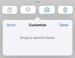
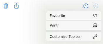
We should now have an overflow menu with a customize toolbar action:
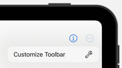
The customize toolbar control lets you drag items to and from the toolbar and reorder items in the toolbar:
Default Customization and Visibility
By default all customizable items are visible in the iPad toolbar (space permitting). You can change this to hide items by default with the defaultCustomization modifier:
ToolbarItem(id: "item.print", placement: .secondaryAction) {
  printButton
}
.defaultCustomization(.hidden)
To control what the user can customize apply the customizationBehavior modifier to an item. You can lock an item in position in the toolbar, or allow a user to reorder an item but not remove it from the toolbar:
ToolbarItem(id: "item.share", placement: .secondaryAction) {
  shareButton
}
.customizationBehavior(.reorderable)

ToolbarItem(id: "item.delete", placement: .secondaryAction) {
  deleteButton
}
.customizationBehavior(.disabled)
Note how the delete action is no longer available for customization. We can move the share action but not remove it from the toolbar.
One aspect of toolbar customization that I was not expecting was that items removed from the toolbar do not automatically appear in the overflow menu. If you want an item to always be available in the overflow menu you can pass an option to the defaultCustomization modifier:
ToolbarItem(id: "item.print", placement: .secondaryAction) {
  printButton
}
.defaultCustomization(options: .alwaysAvailable)
You can combine this with the default customization visibility if you want:
.defaultCustomization(.hidden, options: .alwaysAvailable)
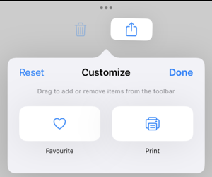
I made both the print and favourites actions always available so they show in the overflow menu even if the user removes them from the toolbar:
This doesn’t seem to work for the iPhone. Once I mark something as hidden it disappears from the overflow menu on the iPhone. That seems like a bug to me (FB11982453). There’s no way to customize the iPhone toolbar so I expect even hidden options to be in the overflow menu, especially if I mark them as always available.
Control Groups
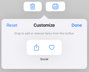
There’s one final refinement to the toolbar. If you have actions that you only want to add, move or remove together you can add them to a control group:
ToolbarItem(id: "item.social", placement: .secondaryAction) {
  ControlGroup {
    shareButton
    faveButton
  } label: {
    Label("Social", systemImage: "square.and.arrow.up")
  }
}
.defaultCustomization(options: .alwaysAvailable)
As before we can control whether the options should always be available in the overflow menu. When customizing the toolbar the actions are now grouped:
Related Articles
See these related articles for other things you can do to the toolbar: