When you create a new Widget you may have noticed that it gets its own asset catalog. As well as the usual AccentColor this also contains a WidgetBackground color. What are these for and how are you supposed to use them?
You might hope that setting the widget background color in the widget’s asset catalog would somehow set the background of your widget:

If you try it, the result will disappoint you as it does no such thing. Before we look at what WidgetBackground does lets cover how you do set the background of a widget.
Setting The Background Of Your Widget
You set the background of a widget in much the same way you set the background of any SwiftUI view. For example, using a ZStack with a Color view as the first item:
var body: some View {
  ZStack {
    Color(.yellow)
    Text("Hello World!")
  }
}
We don’t have to, but we can use the WidgetBackground and AccentColor from the asset catalog if we want to:
ZStack {
  Color("WidgetBackground")
  Text("Hello World!")
    .foregroundColor(Color("AccentColor"))
}
We don’t need to worry about safe areas for a widget. For a normal SwiftUI App if you want the background to go to the edges of the device you’ll need to ignore the safe area insets:
var body: some View {
  ZStack {
    Color(.yellow)
      .ignoresSafeArea()
    Text("Hello, world!")
  }
}
What’s WidgetBackground For?
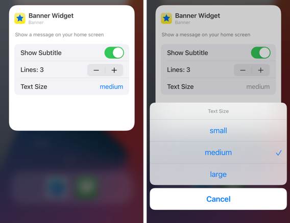
So if WidgetBackground does not directly set the widget background what’s it for? You use the WidgetBackground and AccentColor to style the widget configuration interface of a configurable widget. Apple could have chosen names to make that more obvious.
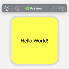
Here’s what the configuration screen of my widget looks like if I don’t set colors for the AccentColor and WidgetBackground in the asset catalog:
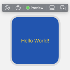
With a light interface style the background defaults to white with a blue accent color used in the menus. Compare that with the following where I set the WidgetBackground to a dark blue and the AccentColor to yellow to match the style used on the front of the widget:
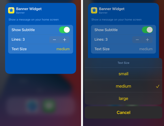
Note: I’ve found that, after changing a color, I often need to reboot the device/simulator before I see the change.
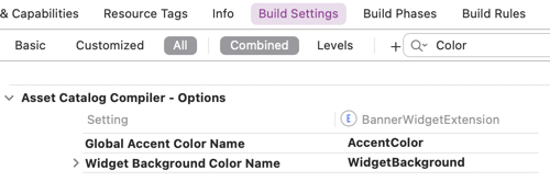
Build settings
The names AccentColor and WidgetBackground are not hard-coded. You can change them in the build settings for the widget extension. Look in the “Asset Catalog Compiler - Options” section for “Global Accent Color Name” and “Widget Background Color Name”: