In a previous post I examined how with iOS 5 it became much easier to customise the appearance of some common UIKit controls using resizable images. In this post I want to go a little further and look at how to use appearance proxies to more fully style an applications user interface.
I should mention that I am writing this post a few weeks ahead of the expected release of iOS 6. This discussion is therefore limited to only those features that are available in iOS 5.
UIAppearance Protocol
As I demonstrated in an earlier post on customising appearance with resizable images many UIKit controls have properties and methods allowing the tintColor, background images and other appearance aspects to be set. However in an application with a large number of controls it can quickly become unmanageable if you are have to directly customise each control.
Luckily Apple introduced the UIAppearance protocol with iOS 5 that has greatly reduced the work required to apply a consistent style to an application. Instead of having to customise the appearance of each UIKit control directly you can customise the appearance of a whole class of UIKit controls (e.g. all the UIButtons in an application). The UIAppearance protocol works by creating an appearance proxy for the UIKit class. Modifying the appearance of the appearance proxy modifies the appearance of all subsequent instances of that class.
To allow some flexibility you can also conditionally customise the appearance of a class based on the containing class. For example, a UIButton can be styled differently based on which view controller contains it. The easiest way to explain the UIAppearance protocol is by way of an example:
Styling An Example App
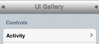
The example app that I will use for the rest of this post is not much more than a catalogue of the most common UIKit controls. Mostly the controls are not even wired-up to target:action methods so that I can skip any code not related to customising appearance. The app uses a single storyboard to define the user interface as shown below:
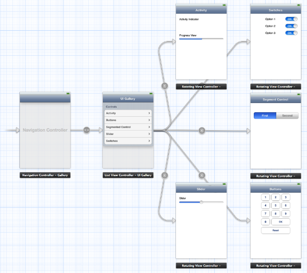
The application is navigation controller based with a static table view as the root view showing each of the UIKit control types that I am going to explore in this post. Selecting a row in the table pushes a new view controller containing an example of a UIKit control onto the navigation stack. The storyboard gives you a pretty good idea of how the user interface appears using the default iOS blue colour scheme but I will try to show a before and after screenshot as we customise each view.
Organising Appearance Code
It is a good idea to collect as much of the appearance code as possible into a single class or method within the app. This makes life much easier when you suddenly decide that you want to completely change the appearance of an app. The approach that I am going to take with the example app is to create a custom class (UYLStyleController) to collect all of the appearance code. The public interface for this class is as follows:
@interface UYLStyleController : NSObject
+ (void)applyStyle;
@end
The single class method +applyStyle is called from the application delegate to setup the appearance of the app before the view hierarchy is loaded. Since we are using storyboards the application delegate is pretty simple:
- (BOOL)application:(UIApplication *)application didFinishLaunchingWithOptions:(NSDictionary *)launchOptions {
  [UYLStyleController applyStyle];
  return YES;
}
UINavigationBar
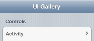
The first thing we do in the applyStyle class method is to customise the appearance of the navigation bar. The default navigation bar is as shown below:
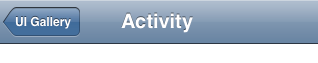
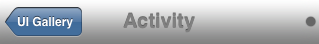
To customise the navigation bar we will apply a custom background image and modify the text attributes of the title. We also need to modify the appearance of the back button when we push a view controller onto the navigation stack as shown below:
To get started we first need to create some resizable images to use for the navigation bar. I covered this approach in detail in the previous post on customising appearance with resizable images so I will briefly recap here. Since the navigation bar on the iPhone has different heights when in portrait and landscape orientations we need to create four different images as follows:
- navbar.png - 44 pixels high for portrait mode (normal resolution)
- navbar@2x.png - 88 pixels high for portrait mode (retina resolution)
- navbar-landscape.png - 32 pixels high for landscape (normal resolution)
- navbar-landscape@2x.png - 64 pixels high for landscape (retina resolution)
The standard resolution navigation image has two end caps each of which is 20 pixels wide separated by a 1 pixel wide strip as follows:
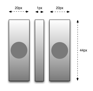
The landscape image is similar except that the height is only 32 pixels and of course the corresponding @2x image files have all dimensions doubled. The portrait and landscape resizable images are created using the resizableImageWithCapInsets method to specify the 20 pixel insets.
+ (void)applyStyle {
UIImage *navBarImage = [UIImage imageNamed:@"navbar"];
navBarImage = [navBarImage resizableImageWithCapInsets:UIEdgeInsetsMake(0, 20.0, 0, 20.0)];

UIImage *navBarLandscapeImage = [UIImage imageNamed:@"navbar-landscape"];
navBarLandscapeImage = [navBarLandscapeImage resizableImageWithCapInsets:UIEdgeInsetsMake(0, 20.0, 0, 20.0)];
We then need to get the appearance proxy object for the UINavigationBar class and use it to set the background image for both portrait and landscape dimensions:
UINavigationBar *navigationBarAppearance = [UINavigationBar appearance];
[navigationBarAppearance setBackgroundImage:navBarImage forBarMetrics:UIBarMetricsDefault];
[navigationBarAppearance setBackgroundImage:navBarLandscapeImage forBarMetrics:UIBarMetricsLandscapePhone];
The next thing we will do is to customise the text attributes of the title. The font, text colour and shadow can all be customised by supplying a dictionary of text attributes. In this case we will just set the text colour using the UITextAttributeTextColor key:
NSDictionary *textAttributes = [NSDictionary dictionaryWithObjectsAndKeys:[UIColor grayColor], UITextAttributeTextColor, nil];
[navigationBarAppearance setTitleTextAttributes:textAttributes];
The navigation bar now looks as shown below with our custom background image and text settings:
To complete the navigation bar customisation we need to also change the style of the back button to replace the default blue style:
Since the back button height varies with the height of the navigation bar when in landscape orientation we will need two resizable images (plus the retina @2x versions) for the back button. The images are created with a 25 pixel inset on the left and a 6 pixel inset on the right as follows:
UIImage *backButtonImage = [UIImage imageNamed:@"back-button"];
backButtonImage = [backButtonImage resizableImageWithCapInsets:UIEdgeInsetsMake(0, 25.0, 0, 6.0)];

UIImage *backButtonLandscapeImage = [UIImage imageNamed:@"back-button-landscape"];
backButtonLandscapeImage = [backButtonLandscapeImage resizableImageWithCapInsets:UIEdgeInsetsMake(0, 25.0, 0, 6.0)];
The UIBarButtonItem appearance proxy can then be used to set the background image of the back button for both portrait and landscape orientations:
UIBarButtonItem *barButtonItemAppearance = [UIBarButtonItem appearance];
[barButtonItemAppearance setBackButtonBackgroundImage:backButtonImage forState:UIControlStateNormal barMetrics:UIBarMetricsDefault];
[barButtonItemAppearance setBackButtonBackgroundImage:backButtonLandscapeImage forState:UIControlStateNormal barMetrics:UIBarMetricsLandscapePhone];
The final effect is as shown below:
View Controller Background
Before getting into the various UIKit controls I should probably mention one small detail about the view controller class that is used for each of the detailed views. Since the application is not doing anything useful other than illustrating how to modify appearance it uses the same view controller class (UYLRotatingViewController) for each of the views. As the name of the controller suggests the main purpose of this class is to enable interface rotation. However since it is common to each of the views we can also implement the viewDidLoad method to set the view background colour for all of the views in one place. The full implementation of the class is shown below:
@implementation UYLRotatingViewController
- (void) viewDidLoad {
  [super viewDidLoad];
  self.view.backgroundColor = [UIColor lightGrayColor];
}

- (BOOL)shouldAutorotateToInterfaceOrientation:(UIInterfaceOrientation)interfaceOrientation {
  return YES;
}
@end
UIButton
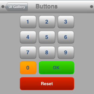
To explore how to customise the appearance of the UIButton I will use a view containing a set of buttons arranged as a numeric keypad as shown below:
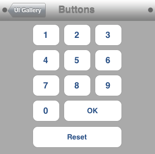
The effect that I want to implement is to add a background image to each button using an approach similar to the way we customised the navigation bar. However in this case I want to use a different background image for some of the buttons. The objective is to make the buttons numbered 1-9 grey, the OK button green, the zero button orange and the reset button red. In all cases I will use resizable background images to create a gradient effect with cap insets to provide the rounded corners.
For the basic button appearance I have created a button image (steel-button.png) that is 41 pixels wide and 44 pixels high. I will not mention it again but all of these images also have @2x versions with double the dimensions. The cap inset for the rounded corners is 20 pixels on each side.
We have seen how to create a resizable image with cap insets a number of times so I will just show the code without further comment:
UIImage *defaultButtonImage = [UIImage imageNamed:@"steel-button"];
defaultButtonImage = [defaultButtonImage resizableImageWithCapInsets:UIEdgeInsetsMake(0, 20.0, 0, 20.0)];
Now I could just get the appearance proxy object for the UIButton class and use it to set the background image. However in this case I am going to be a little more restrictive and only customise UIButton objects that are contained by the UYLRotatingViewController view controller. This is generally a good approach when customising UIButton as it turns up in lots of different places in a user interface. For example, if I use the UIButton appearance proxy directly I would also end up modifying the disclosure indicators shown in the root table view.
To specify that you only want to customise the appearance of an object when it is contained by another class (or classes) you use the appearanceWhenContainedIn method and provide a nil terminated list of appearance container classes. In this case we have just a single container class:
[[UIButton appearanceWhenContainedIn:[UYLRotatingViewController class], nil] setBackgroundImage:defaultButtonImage forState:UIControlStateNormal];
That takes care of the default case for the numbers 1-9 but the other buttons are a little more tricky. To customise the zero, OK and Reset buttons we make use of the fact that the appearance protocol will also work with our own custom subclasses of the standard UIKit controls. So we can subclass UIButton for each of our custom buttons and apply the appearance changes to those subclasses.
A similar approach will work for all three buttons so I will only discuss the OK button. The first thing we will do is create a custom subclass of UIButton named UYLOkButton. This subclass is trivial as it has no additional implementation code:
@interface UYLOkButton : UIButton
@end

@implementation UYLOkButton
@end
Once we have this class defined we can customise the button in the storyboard to specify the UYLOkButton class.
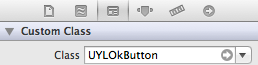
The code to set the background image of the UYLOkButton class is similar to before except that we use our custom class in place of the generic UIButton class:
UIImage *okButtonImage = [UIImage imageNamed:@"green-button"];
okButtonImage = [okButtonImage resizableImageWithCapInsets:UIEdgeInsetsMake(0, 20.0, 0, 20.0)];
[[UYLOkButton appearanceWhenContainedIn:[UYLRotatingViewController class], nil] setBackgroundImage:okButtonImage forState:UIControlStateNormal];
The zero and reset buttons use a similar technique so I will not show the code. The only addition is that I change the text color for the reset button to white to make it show up more clearly:
[[UYLResetButton appearanceWhenContainedIn:
  [UYLRotatingViewController class], nil]
 setTitleColor:[UIColor whiteColor] forState:UIControlStateNormal];
The final effect is shown below:
UIActivityIndicator, UIProgressView and UILabel
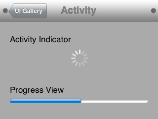
The next set of controls I am going to look at are much more straightforward. The activity view contains some UILabel items, a large white UIActivityIndicator and a UIProgressView. The default appearance is shown below:
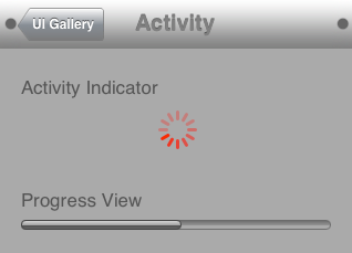
I am going to use a mix of mostly dark and light grey colours for the various elements so I will start by defining those colours:
UIColor *mainColor = [UIColor darkGrayColor];
UIColor *altColor = [UIColor lightGrayColor];
Now I will set the text color for all UILabel objects that appear in my container view controller:
UILabel *labelAppearance = [UILabel appearanceWhenContainedIn:[UYLRotatingViewController class], nil];
[labelAppearance setTextColor:mainColor];
The UIActivityIndicator does not provide much in the way of customisation options but one thing we can do is change the colour. In this we will change it to red:
[[UIActivityIndicatorView appearance] setColor:[UIColor redColor]];
Finally we will adjust the progress view to use our own colour scheme for the various parts of the track:
[[UIProgressView appearance] setProgressTintColor:mainColor];
[[UIProgressView appearance] setTrackTintColor:altColor];
The end result of these customisations is shown below:
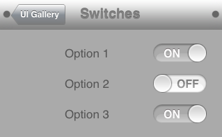
UISwitch
The default UISwitch appearance is shown in the screenshot below. Note that the UILabel elements in this view are already using the custom appearance we created previously:
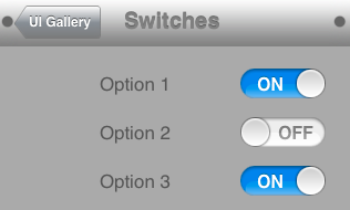
With iOS 5 we can customise the tint color for the ON portion of the switch:
[[UISwitch appearance] setOnTintColor:altColor];
This gives the switches the following appearance:
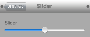
UISlider
The default UISlider appearance is similar to the UIProgressView with the addition of the progress indicator “thumb”:
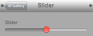
We can set the both the minimum (left of thumb) and maximum (right of thumb) track tint and also the tint color of the thumb appearance as follows:
[[UISlider appearance] setMinimumTrackTintColor:mainColor];
[[UISlider appearance] setMaximumTrackTintColor:altColor];
[[UISlider appearance] setThumbTintColor:[UIColor redColor]];
The result is shown below:
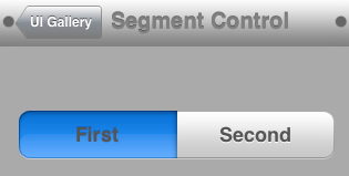
UISegmentedControl
The last UIKit control that I am going to look at is the UISegmentedControl which with two segments has the following default appearance when the first segment is selected:
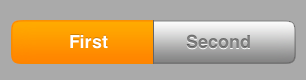
To customise the UISegmentedControl we will use our previously created orange and steel button resizable images to set the background for both the normal and selected states of a segment:
[[UISegmentedControl appearance] setBackgroundImage:defaultButtonImage
  forState:UIControlStateNormal barMetrics:UIBarMetricsDefault];
[[UISegmentedControl appearance] setBackgroundImage:zeroButtonImage
  forState:UIControlStateSelected barMetrics:UIBarMetricsDefault];
There is one small complication with the UISegmentedControl in that it also has an image for the divider between the segments. At present if we do nothing else our segmented control is left with an ugly default blue divider:
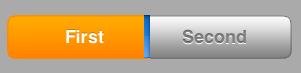
To fix the divider we need to create an image 1 pixel wide and 44 pixels hide to act as the divider. We can then set the divider as follows:
UIImage *dividerImage = [UIImage imageNamed:@"divider"];
[[UISegmentedControl appearance] setDividerImage:dividerImage
 forLeftSegmentState:UIControlStateNormal
 rightSegmentState:UIControlStateNormal
 barMetrics:UIBarMetricsDefault];
The documentation for UISlider suggests that you should set divider images for the various combinations of selected and normal segments. In this case I found it sufficient to just cover the default case of both segments in the normal state. The resulting appearance is shown below:
Wrapping Up
I hope that gives you an idea on how to make use of appearance proxies when customising the appearance of an iOS app. I have not covered every option for every control as once you get the idea the technique is pretty much always the same. The example Styles Xcode project that accompanies this post can be found in my GitHub Code Examples repository should you want to take a closer look.