Maybe I am getting old but I am starting to pay much more attention to how easy it is to read text on mobile devices. Text size is important but the impact of color and contrast is often overlooked. You make it harder for a user to read text when you choose text and background colours with a low contrast ratio.
But what colors make text more legible for users? If you have a coloured button are you better having white or black text for the label? In this post I share some tips I picked up from an excellent Apple WWDC session on inclusive app design.
Last updated: Dec 30, 2022
High Contrast for Legibility
It is the combination of small text size and low colour contrast that makes text hard to read. From the iOS Human Interface Guidelines:
Use sufficient color contrast ratios. Insufficient contrast in your app makes content hard to read for everyone. Icons and text might blend with the background, for example. An online color contrast calculator can help you accurately analyze the color contrast in your app, to ensure that it meets optimal standards. Strive for a minimum contrast ratio of 4.5:1, although 7:1 is preferred because it meets more stringent accessibility standards.
Contrast Checker Tools
There’s a wide selection of color checker tools you can use to check if your color and font choices meet the minimum contrast ratio. Here are my favourites:
-
Contrast Ratio Calculator by Lea Verou. This is the calculator I’m using for the examples in this post. I find it the easiest to use as it accepts a wide variety of color formats (names, rgb, hex, hsla, etc.).
-
Xcode Color Contrast Calculator. The Xcode Accessibility Inspector includes a contrast checker. First open the inspector from the Xcode menu (
Xcode>Open Developer Tool>Accessibility Inspector). Then from theWindowmenu, selectShow Color Contrast Calculator: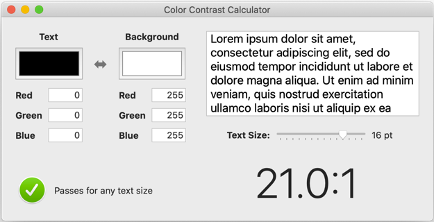
It’s good for quick checks but I find the results differ slightly from the other two tools I list here.
-
Contrast Checker: This is the most comprehensive of the tools as it also tests readability for people with color blindness.
-
Accessible Colors This site is great if you’re struggling to find working color combinations. It suggests how to change your existing colors to make them accessible.
Stop Hurting My Eyes
To show how contrast and text size impact legibility let’s start with a deliberately bad set of choices. I am using two UILabels to display a headline and body text. The headline text is 20 point bold and the body 14 point. Both text labels are light gray (r:170,g:170,b:170) on a magenta background (r:255,g:0,b:255).
The text in this example is beyond what I can comfortably read on a device. If I plug the text and background colours into the contrast calculator you can see why:
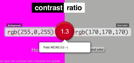
The contrast ratio between the light gray text and magenta background is only 1.3:1 which is well below the Web Content Accessibility Guidelines (WCAG) recommendation to use at least 4.5:1 for text smaller than 18 point.
We can improve the contrast by using a darker background. Here is what it looks like with a plum (r:128,g:0,b:128) background:
We have a better contrast ratio of 4.1:1 but as we can see from the contrast calculator there is room for improvement:
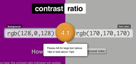
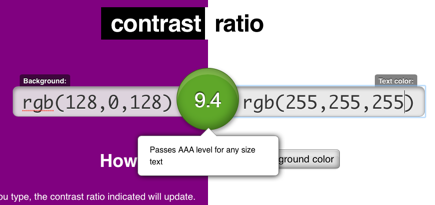
A ratio of 4.1:1 is fine for large text sizes above 18 point or 14 point if bold. Our body text is 14 point with a normal weight so this is still a fail. We have three choices - change the colour, increase the font size or use a bold font. My preference is to replace the problematic light gray with white text. This has a big impact on legibility (using dynamic type sizes to allow the user to increase the font size would also be a good idea):

Our contrast ration is now 9.4:1 which is enough to earn us a AAA rating:
Button Colours
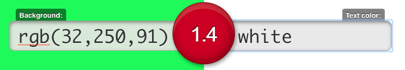
The contrast calculator makes it easy for us to answer the question about which colour is best in a given situation. Suppose I have a green button. Am I better with white or black for the label?
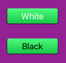
The green button background image is a gradient so I will use the mid-point which is r:32,g:250,b:91. The contrast ratio calculator gives us a poor score of 1.4:1 for white text:
Using black text we get an excellent score of 14.9:1:
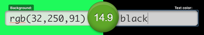
So the answer in this case is to use black text.
Hints and Tips
Some further hints and tips from the WWDC session:
- When testing don’t rely on how it looks running in the simulator on a large Mac screen. Try it on the smallest device you support in different lighting.
- For a quick sense of how contrast impacts legibility use the accessibility settings to switch to greyscale.
- The luminosity ratio between two colors varies from the lowest 1:1 for matching colours up to 21:1 for white on black.
- Keep grey text for inactive states.
Summary of Recommendations
The WCAG recommendations you should aim for:
- At least 4.5:1 contrast ratio between text and background colours for text sizes smaller than 18 point if not bold or smaller than 14 point if bold.
- At least 3.1 contrast ratio between text and background colours for text at least 18 point if not bold or at least 14 point if bold.
Note that these are the least you should achieve the Apple HIG recommends a preferred target of 7:1 for greater legibility.