Before you switch to a custom font don’t overlook how much you can tweak the appearance of the system fonts. A quick review of some font APIs that work for both UIKit and SwiftUI.
Tweaking The System Fonts
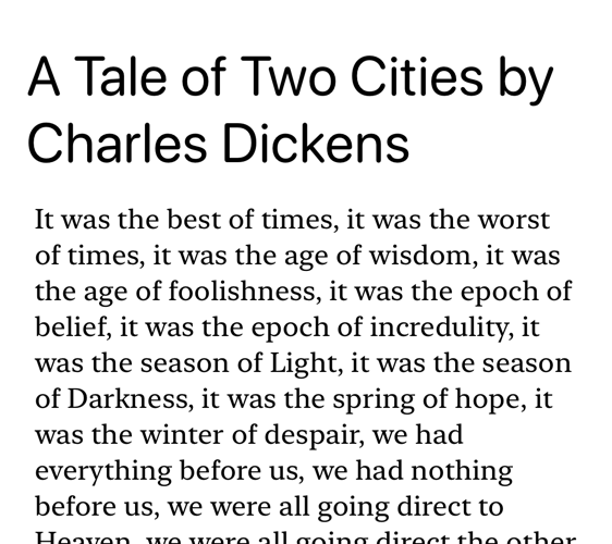
Here’s my starting point. I’m using dynamic type with a large title and body text. I’m not going to spend time on the layout details. (See this post on scroll view layouts for a UIKit example).

At the default large content size, on iOS, the title and body are using the regular SF Pro system font. Let’s see how we can change how this text looks.
Changing The Font Design
Starting with iOS 13, Apple ships two families of system fonts. The San Francisco font is a sans serif typeface with rounded and monospaced variations. The New York font is a serif typeface. You can switch between these font variations by specifying the font design. There are four options:
default: SF Promonospaced: SF Monorounded: SF Pro Roundedserif: New York
In UIKit, you do this by first getting the font descriptors for the text style, applying the design and then getting an instance of the font. For example, switching the title label to use the rounded design:
// UIKit - rounded large title font
if let descriptor = UIFontDescriptor.preferredFontDescriptor(
  withTextStyle: .largeTitle)
  .withDesign(.rounded) {
  titleLabel.font = UIFont(descriptor: descriptor, size: 0)
}
Let’s also switch the body to use the serif New York font:
// UIKit - New York body font
if let descriptor = UIFontDescriptor.preferredFontDescriptor(
  withTextStyle: .body)
  .withDesign(.serif) {
  bodyText.font = UIFont(descriptor: descriptor, size: 0)
}
Here’s how that looks with a rounded SF Pro title and New York body:

For comparison here are the original and rounded versions of the title at a larger accessibility content size (rounded at the bottom):

Using the monospaced variation for the body:
.withDesign(.monospaced)

We can do the same in SwiftUI with a lot less boilerplate. I’m using two text views in a vertical stack. There are a several ways of specifying the font with SwiftUI. Starting with the most concise when working with text styles:
Text(titleText)
.font(.largeTitle)
To also specify the design we can use the fuller version of the Font initializer:
Text(titleText)
.font(Font.system(.largeTitle, design: .rounded))
So our full example with a rounded title and serif body becomes:
VStack(spacing: spacing) {
  Text(titleText)
  .font(Font.system(.largeTitle, design: .rounded))

  Text(bodyText)
  .font(Font.system(.body, design: .serif))
}
Symbolic Traits
As well as changing the font family we can vary many of the characteristics of the typeface by applying one or symbolic traits to the font descriptor. For example to make a font bold and italic:
if let descriptor = UIFontDescriptor.preferredFontDescriptor(
  withTextStyle: .body)
  .withSymbolicTraits([.traitItalic, .traitBold]) {
  bodyText.font = UIFont(descriptor: descriptor, size: 0)
}
The commonly used symbolic traits:
traitItalic,traitBoldtraitExpanded,traitCondensed,traitMonoSpacetraitTightLeading,traitLooseLeading
See the UIFontDescriptor.SymbolicTraits documentation for the full list.
For my example, I’m going to tighten the leading on the title font and loosen it on the body text. First the verbose UIKit version:
if let descriptor = UIFontDescriptor.preferredFontDescriptor(
  withTextStyle: .largeTitle)
  .withSymbolicTraits([.traitTightLeading])?
  .withDesign(.rounded) {
  titleLabel.font = UIFont(descriptor: descriptor, size: 0)
}

if let descriptor = UIFontDescriptor.preferredFontDescriptor(
  withTextStyle: .body)
  .withSymbolicTraits([.traitLooseLeading])?
  .withDesign(.serif) {
  bodyText.font = UIFont(descriptor: descriptor, size: 0)
}
The SwiftUI version is, I hope we can agree, an improvement:
Text(titleText)
  .font(Font.system(.largeTitle, design: .rounded)
    .leading(.tight))

Text(bodyText)
  .font(Font.system(.body, design: .serif)
    .leading(.loose))
Note: The .leading method was only added to Font in iOS 14.
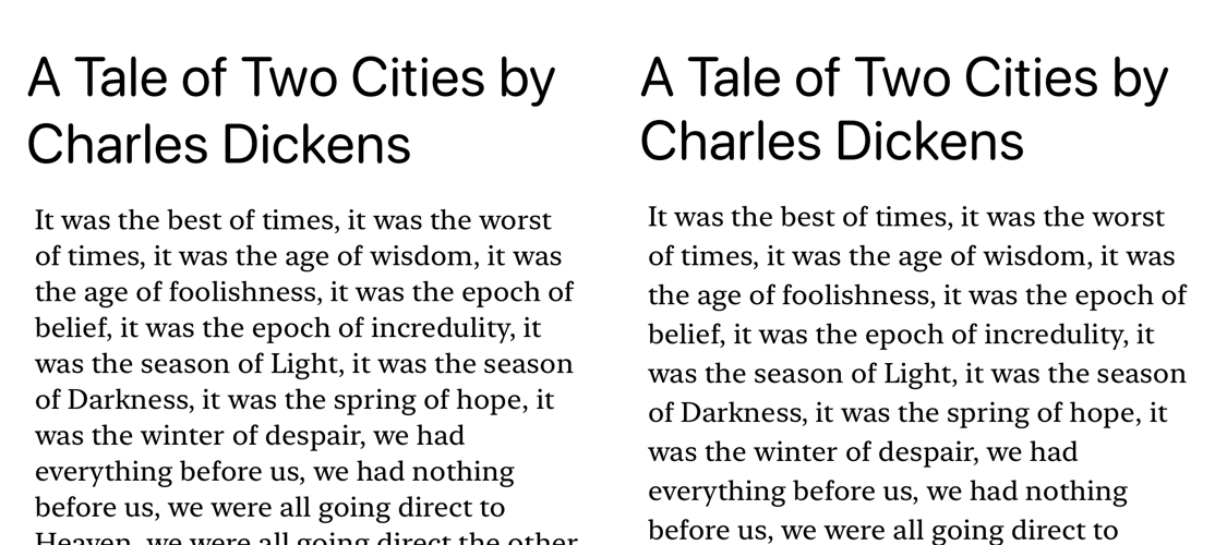
The before and after appearances for comparison:

The effect is subtle. I’ve tightened the title line height which I think helps keep the title together when it flows over several lines. Likewise, loosening the body text increases the amount of white space in this large block of text.
Font Features
I’ve stuck to changing only those things about the system fonts that have direct API support. If you want to dig more into font features there are many more options. For an example, take a look at this post from the archives that looks at how to deal with proportional numbers.