Starting with iOS 16, the NavigationSplitView is the preferred way to create two or three column layouts on the iPad and Mac. It has configuration options to control the column visibility, width and style.
Last updated: Jul 13, 2024
NavigationSplitView (iOS 16)
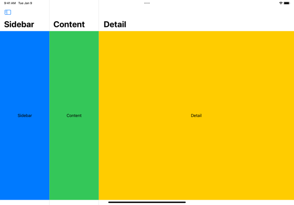
For a recap on using the NavigationStack and NavigationSplitView see the WWDC22 session The SwiftUI cookbook for navigation. A three-column split view has sidebar, content and detail columns:
// Three-column
NavigationSplitView {
  Sidebar()
} content: {
  Content()
} detail: {
  Detail()
}
A two-column split view has a sidebar and detail columns:
// Two-column
NavigationSplitView {
  Sidebar()
} detail: {
  Detail()
}
I’m going to start with a two-column split view to explore the configuration options:
struct WorldView: View {
  @EnvironmentObject var store: WorldStore
  @State private var selection: Country?

  var body: some View {
    NavigationSplitView {
      List(store.countries, selection: $selection) { country in
        NavigationLink(value: country) {
          CountryCell(country: country)
        }
      }
      .navigationTitle("World")
    } detail: {
      if let country = selection {
        CountryView(country: country)
      } else {
        Text("Select a country")
      }
    }
  }
}
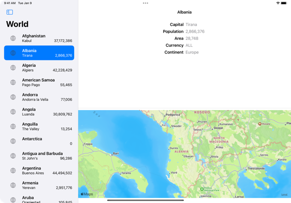
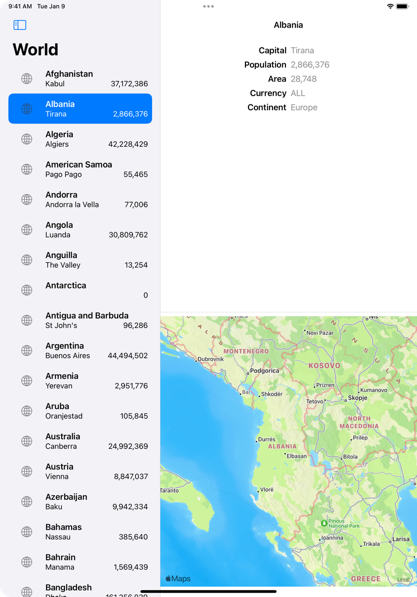
The sidebar is a list country cells, the detail column shows the selected country. This gives us the familiar sidebar-detail split view on an iPad in landscape:
Note the sidebar display mode button in the toolbar which toggles the sidebar visibility:
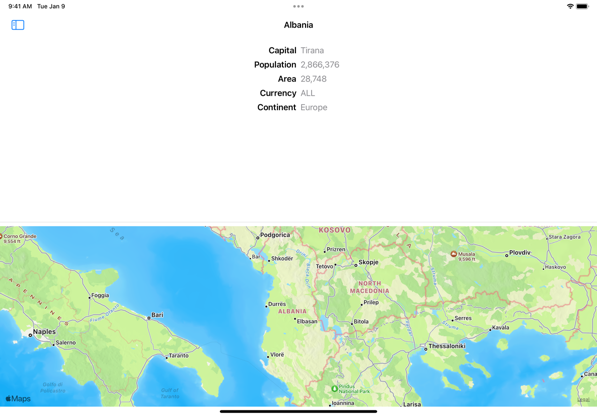
In portrait, the split view defaults to hiding the sidebar and slides it over the detail view when toggled by the button:
The split view collapses into a stack navigation for compact screens such as the iPhone and the iPad in slide over.
Split View Visibility
You can programmatically control the sidebar display mode by passing a binding to a NavigationSplitViewVisibility state property to the split view:
@State private var columnVisibility =
  NavigationSplitViewVisibility.doubleColumn

var body: some View {
  NavigationSplitView(columnVisibility: $columnVisibility) { ... }
There are four possible values:
automatic: This is the default and provides a platform suitable display mode.all: Shows all columns.doubleColumn: Shows the content and detail columns of a three-column split view or the sidebar and detail columns of a two-column split view.detailOnly: Collapses the split view to shows only the detail column.
Note that for a two-column split-view the all and doubleColumn modes are the same.
You cannot remove the display mode button.
Split View Style
The split view style modifier controls whether the split view overlays the sidebar/content on the detail view or presents them side-by-side. There are three built-in styles:
automatic: This is the default and provides a context specific style.balanced: This style reduces the size of the detail view to make room to show the leading column(s) side-by-side.prominentDetail: This style tries to maintain the size of the detail view by showing the leading columns overlayed over the detail view.
Note: On an iPad, the automatic style gives you a balanced (side-by-side) style in landscape and prominent detail (sidebar overlay) in portrait.
For example, if I always want to show the sidebar side-by-side in both portrait and landscape I can apply the balanced style to our split view:
NavigationSplitView(columnVisibility: $columnVisibility) {
  // sidebar
} detail: {
  // detail view
}
.navigationSplitViewStyle(.balanced)
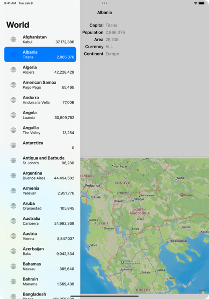
The sidebar is now always shown side-by-side with a reduced width detail view. Compare this with the earlier screenshot of the portrait orientation which has the sidebar in an overlay:
Note that the user can still toggle the visibility of the sidebar. This is similar to the .allVisible preferred display mode of UISplitViewController.
Split View Width
Finally you can configure the preferred column widths. There are two versions of the modifier depending on whether you want a fixed or flexible width. The flexible width modifier accepts an ideal width and optional min and max values:
// Fixed column width
.navigationSplitViewColumnWidth(200)

// Flexible column width
.navigationSplitViewColumnWidth(min: 300, ideal: 400, max: 500)
I was unable to get this to work for the sidebar column on iPadOS 16 and iPadOS 17 (FB10749141). I could reduce the sidebar width, but not increase it. It does work for me starting with the iPadOS 18 betas..
Note: The widths are preferred and the split view can ignore them if the presentation environment doesn’t allow resizing columns.
Here’s an example with a three-column split view where I’ve set a fixed width for the first two columns:
struct ContentView: View {
  @State private var columnVisibility =
    NavigationSplitViewVisibility.all

  var body: some View {
    NavigationSplitView(columnVisibility: $columnVisibility) {
      Sidebar()
        .navigationSplitViewColumnWidth(200)
    } content: {
      Content()
        .navigationSplitViewColumnWidth(200)
    } detail: {
        Detail()
    }
    .navigationSplitViewStyle(.balanced)
  }
}
Here’s how it looks on an iPad in landscape: