Apple added pie charts to SwiftUI in iOS 17. Here’s an example to get you started.
Getting Started
If you’ve already uses the Charts framework to create line, bar, or other types of chart creating a pie chart will look familiar:
Chart {
  SectorMark(angle: .value("Red", 0..<10))
    .foregroundStyle(.red)
  SectorMark(angle: .value("Green", 10..<20))
    .foregroundStyle(.green)
  SectorMark(angle: .value("Blue", 20..<30))
    .foregroundStyle(.blue)
}
The SectorMark, new in iOS 17, is what makes this a pie chart. It has one required parameter the “angle” for each segment of the pie. This is not the real angle (in degrees/radians) of the sector but a plottable value or range that maps to the angular size of the sector in proportion to the overall range of the data.
In this first example, I’m supplying a range that defines the explicit start/end values for each sector. My ranges are all “10” in size in the overall range 0..<30 so we end up with a pie chart divided into three equal sectors:
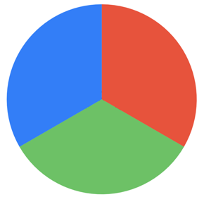
The foregroundStyle view modifier sets the colour for each sector.
Plotting Data
Rather than using fixed ranges let’s build a chart with some plottable data. I’m going to chart the counts for posts I’ve made for various categories on this site:
struct PostCount {
  var category: String
  var count: Int
}

let byCategory: [PostCount] = [
  .init(category: "Xcode", count: 79),
  .init(category: "Swift", count: 73),
  .init(category: "SwiftUI", count: 58),
  .init(category: "WWDC", count: 15),
  .init(category: "SwiftData", count: 9)
]
I’m passing that data into my PieChartView. I’m using the Chart initializer that takes the data collection as input and passes each item in turn to the content closure. Since my PostCount structure isn’t Identifiable I need to tell charts to use the category key path as a unique identifier.
import Charts
import SwiftUI

struct PieChartView: View {
  let data: [PostCount]

  var body: some View {
    Chart(data, id: \.category) { item in
      SectorMark(
        angle: .value("Count", item.count)
      )
      .foregroundStyle(by: .value("Category", item.category))
    }
    .scaledToFit()
  }
}
This time I’m passing a single value, the post count, to the SectorMark. If you add up my input data you’ll see I have 234 posts across all categories. Each sector is then sized in proportion to that total count:
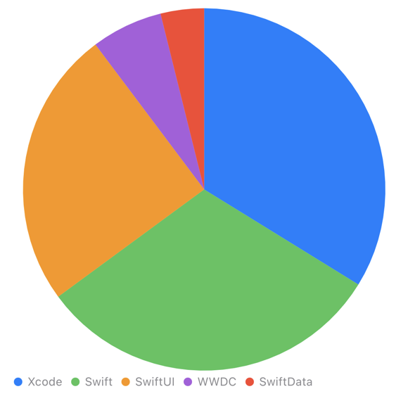
I pass the unique item category name as a value to the foreground style so we get a different colour for each sector.
Note: Apple recommends you limit pie charts to no more than 5-7 sectors. The input data should only contain positive values. You may also want to combine small sectors into an “other” category to make them easier to see.
Customising The Sector Mark
The sector mark has three optional parameters to configure the pie chart:
- innerRadius: Adding an inner radius creates a donut shaped chart. The radius can be a fixed size in points, a ratio or inset relative to the outer radius.
- outerRadius: The outer radius controls the chart size. It can be a fixed size in points, or a ratio/inset relative to the available plot area.
- angularInset: Creates some separation between the segments.
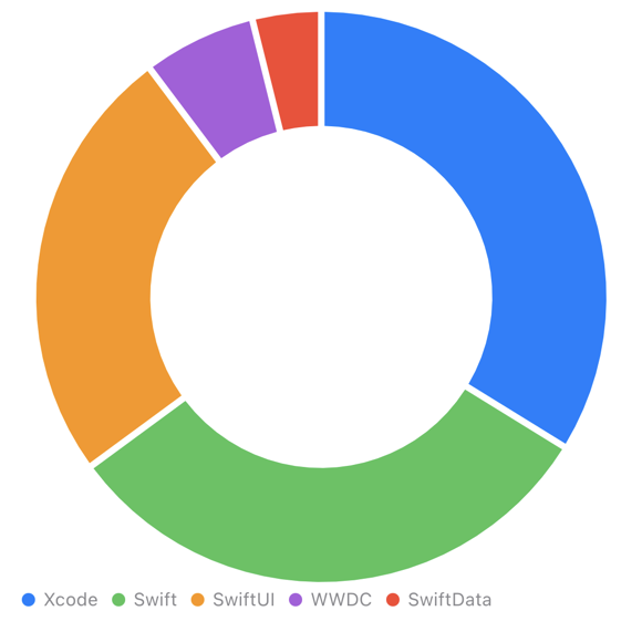
Adding an inner radius turns my pie chart into a donut. I’ve also made use of the angular inset to separate the sectors:
Chart(data, id: \.category) { item in
  SectorMark(
    angle: .value("Count", item.count),
    innerRadius: .ratio(0.6),
    angularInset: 2
  )
  .foregroundStyle(by: .value("Category", item.category))
}
.scaledToFit()
More Chart Customisations
SwiftUI Charts are highly configurable and many of the customisations are not specific to pie charts. I’ll limit myself to one example:
Chart(data, id: \.category) { item in
  SectorMark(
    angle: .value("Count", item.count),
    innerRadius: .ratio(0.6),
    angularInset: 2
  )
  .cornerRadius(5)
  .foregroundStyle(by: .value("Category", item.category))
}
.scaledToFit()
.chartLegend(alignment: .center, spacing: 16)
I’ve added a corner radius to each sector mark. I’ve also center aligned the legend and increased the spacing between the chart and the legend:
Putting A View In The Hole
A donut chart is asking to have a title view in the center hole. That takes a little bit of geometry work using the chart background view modifier:
Chart(data, id: \.category) { item in
  ...
}
.chartBackground { chartProxy in
  GeometryReader { geometry in
    if let anchor = chartProxy.plotFrame {
      let frame = geometry[anchor]
      Text("Categories")
        .position(x: frame.midX, y: frame.midY)
    }
  }
}
The chart background closure gives us a chart proxy which we use to get the frame of the chart’s plot. A geometry reader converts the plot frame to screen coordinates to find the center position for the text view:

Adding Interactivity
The WWDC23 video on pie charts has some good examples of adding interactivity to charts. I’ll use that approach to show more details in the chart center as the user clicks on each sector.
We’ll start by adding a State variable to capture the selected angle. As with the sector mark this “angle” is in the range of 0 to the total of our post counts:
@State private var selectedAngle: Double?
The .chartAngleSelection view modifier takes a binding to this state variable:
Chart(data, id: \.category) { item in
}
.chartAngleSelection(value: $selectedAngle)
To make use of this we need to find the selected sector for any given value of the selected angle. That needs a little up-front work to calculate the post count range of each sector:
private let categoryRanges: [(category: String, range: Range<Double>)]
private let totalPosts: Int

init(data: [PostCount]) {
  self.data = data
  var total = 0
  categoryRanges = data.map {
    let newTotal = total + $0.count
    let result = (category: $0.category,
                  range: Double(total) ..< Double(newTotal))
    total = newTotal
    return result
  }
  self.totalPosts = total
}
For reference, my categoryRanges ends up looking like this:
[
 (category: "Xcode", range: Range(0.0..<79.0)),
 (category: "Swift", range: Range(79.0..<152.0)),
 (category: "SwiftUI", range: Range(152.0..<210.0)),
 (category: "WWDC", range: Range(210.0..<225.0)),
 (category: "SwiftData", range: Range(225.0..<234.0))
]
To find the selected category (if any):
var selectedItem: PostCount? {
  guard let selectedAngle else { return nil }
  if let selected = categoryRanges.firstIndex(where: {
    $0.range.contains(selectedAngle)
  }) {
    return data[selected]
  }
  return nil
}
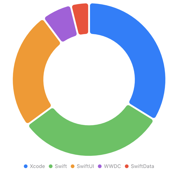
With that bookkeeping done lets change the opacity of the selected sector:
SectorMark( ... )
  .opacity(item.category == selectedItem?.category ? 1 : 0.5)
I want the background view to show the selected category and its post count in the center instead of a fixed text view:
.chartBackground { chartProxy in
  GeometryReader { geometry in
    if let anchor = chartProxy.plotFrame {
      let frame = geometry[anchor]
      titleView
        .position(x: frame.midX, y: frame.midY)
    }
  }
}
I extracted the title view for convenience:
private var titleView: some View {
  VStack {
    Text(selectedItem?.category ?? "Categories")
      .font(.title)
    Text((selectedItem?.count.formatted() ?? totalPosts.formatted()) + " posts")
      .font(.callout)
  }
}
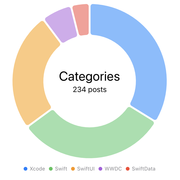
Here’s how it looks with no sector selected showing the total post count:
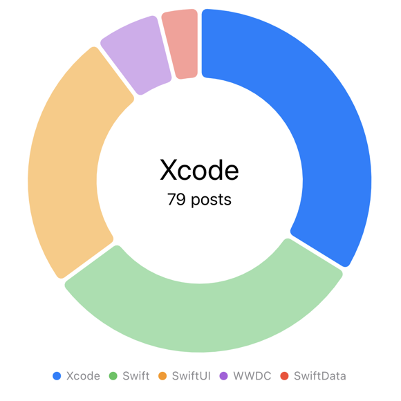
Selecting the Xcode sector:
For reference, here’s how the chart code ended up:
Chart(data, id: \.category) { item in
  SectorMark(
    angle: .value("Count", item.count),
    innerRadius: .ratio(0.6),
    angularInset: 2
  )
  .cornerRadius(5)
  .foregroundStyle(by: .value("Category", item.category))
  .opacity(item.category == selectedItem?.category ? 1 : 0.5)
}
.scaledToFit()
.chartLegend(alignment: .center, spacing: 16)
.chartAngleSelection(value: $selectedAngle)
.chartBackground { chartProxy in
  GeometryReader { geometry in
    if let anchor = chartProxy.plotFrame {
       let frame = geometry[anchor]
      titleView
        .position(x: frame.midX, y: frame.midY)
    }
  }
}
.padding()