Tired of building your own views with a label next to a value? Apple added the LabeledContent view in iOS 16 and macOS 13. It’s a convenient container view that combines a label and a content view representing a value.
What Is Labeled Content?
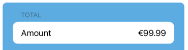
When building a user interface you commonly need to show a value with a label:
Creating this manually involves something like a HStack and some attention to the alignment and formatting of the value:
HStack {
  Text("Amount")
  Text(cost.formatted(.currency(code: "EUR")))
      .frame(maxWidth: .infinity, alignment: .trailing)
}
It’s a common enough pattern that Apple added a LabeledContent container view to iOS 16 (and macOS 13):
// @State private var subject = "Order status"

LabeledContent("Subject", value: subject)

The LabeledContent view attempts to format the label and content based on the context. In this case the value view is right-aligned and uses a subheadline text style.
Formatted Values
You can pass a formatter to the labeled content to apply to the value. For example, to recreate the first example with a currency value:
// @State private var cost = 99.99

LabeledContent("Amount", value: cost,
  format: .currency(code: "EUR"))

That’s a lot less work.
Subtitled Labels
Another common scenario that LabeledContent handles automatically is when you want the label to have a title and subtitle. Passing two text views to the label embeds them in a leading-aligned vertical stack and applies a subheadline style to the second of the text views:
// @State private var subject = "Order status"

LabeledContent {
  Text(subject)
} label: {
  Text("Subject")
  Text("What's this about?")
}

Toggles and Pickers
Both Toggle and Picker views also gain similar capabilities in iOS 16. For example, here’s a toggle with a label made up of two Text views which are automatically styled in a leading aligned vertical stack:
Toggle(isOn: $share) {
  Text("Share Publicly")
  Text("This allows anyone to see this feedback")
}

Be aware this only works on iOS 16. It compiles, without warning, on iOS 15 but the visual layout is not the same:

A Picker works much the same way:
Picker(selection: $severity) {
  ForEach(Severity.allCases) { severity in
    Text(severity.rawValue.capitalized)
  }
} label: {
  Text("Severity")
  Text("How important is this feedback?")
}