A quick tip on creating convenient extensions on SwiftUI Label and Button Styles.
Button and Label Styles
I’ve written about creating custom SwiftUI Button and Label styles. Here’s an example of an adaptive label style which switches the icon and title to a vertical layout for compact horizontal size classes:
struct AdaptiveLabelStyle: LabelStyle {
  @Environment(\.horizontalSizeClass) var horizontalSizeClass

  func makeBody(configuration: Configuration) -> some View {
    if horizontalSizeClass == .compact {
      VStack {
        configuration.icon
        configuration.title
      }
    } else {
      Label(configuration)
    }
  }
}
Another example of a custom capsule button style which places the button label in a filled yellow capsule, uses a monospaced font design, and animates the symbol when pressed:
struct CapsuleButtonStyle: ButtonStyle {
  func makeBody(configuration: Configuration) -> some View {
    configuration.label
      .padding()
      .foregroundStyle(.black)
      .background(.yellow, in: Capsule())
      .fontDesign(.monospaced)
      .symbolVariant(configuration.isPressed ? .fill : .none)
  }
}
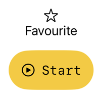
Here’s how they both look when applied to a view:
VStack(spacing: 16) {
  Label("Favourite", systemImage: "star")
    .labelStyle(AdaptiveLabelStyle())

  Button("Start", systemImage: "play.circle") {}
    .buttonStyle(CapsuleButtonStyle())
}
This is like creating custom View modifiers. The difference is that it seems less common to create the convenience extension on LabelStyle or ButtonStyle. For example, I’d like to use a more compact form of the modifier:
Label("Favourite", systemImage: "star")
  .labelStyle(.adaptive)

Button("Start", systemImage: "play.circle") {}
  .buttonStyle(.capsule)
It’s a small improvement, but I don’t see any documentation from Apple on how to achieve that.
Extending ButtonStyle
Looking at the definitions of the built-in styles gives us a clue on what’s needed. For example, here’s the bordered button style (some annotations omitted for brevity):
extension PrimitiveButtonStyle where Self == BorderedButtonStyle {
  static var bordered: BorderedButtonStyle { get }
}
I’m not using the more flexible PrimitiveButtonStyle but a similar approach works for ButtonStyle:
extension ButtonStyle where Self == CapsuleButtonStyle {
  static var capsule: CapsuleButtonStyle {
    CapsuleButtonStyle()
  }
}
I can now use the compact form of the button style modifier:
.buttonStyle(.capsule)
Extending LabelStyle
The LabelStyle works the same way:
extension LabelStyle where Self == AdaptiveLabelStyle {
  static var adaptive: AdaptiveLabelStyle {
    AdaptiveLabelStyle()
  }
}
That allows me to write:
.labelStyle(.adaptive)
What About Parameters?
What if my custom style has a parameter? Let’s make the color in our capsule button style configurable:
struct CapsuleButtonStyle: ButtonStyle {
  let color: Color

  init(_ color: Color) {
    self.color = color
  }

  func makeBody(configuration: Configuration) -> some View {
    configuration.label
      .padding()
      .foregroundStyle(.black)
      .background(color, in: Capsule())
      .fontDesign(.monospaced)
      .symbolVariant(configuration.isPressed ? .fill : .none)
  }
}
Our ButtonStyle extension becomes a function instead of a var:
extension ButtonStyle where Self == CapsuleButtonStyle {
  static func capsule(_ color: Color) -> CapsuleButtonStyle {
    CapsuleButtonStyle(color)
  }
}
In use:
.buttonStyle(.capsule(.orange))