Want to add some gradients and drop shadows to your flat design? Starting with iOS 16, SwiftUI adds a gradient property to Color and some convenient modifiers to ShapeStyle to add drop and inner shadows to views.
Color Gradients
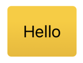
The gradient property of Color returns a color gradient of type AnyGradient which you can use as a ShapeStyle:
Text("Hello")
.padding()
.background(.yellow.gradient,
  in: RoundedRectangle(cornerRadius: 4))
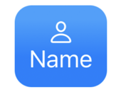
Or when setting the background style for views:
VStack {
  Image(systemName: "person")
  Text("Name")
}
.background(in: RoundedRectangle(cornerRadius: 2)
  .inset(by: -10))
.backgroundStyle(.blue.gradient)
.foregroundStyle(.white)
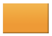
Shadow Styles
The ShadowStyle gives us some convenient modifiers to add drop and inner shadows to colors. The drop shadow takes a radius for the shadow’s size and optional horizontal (x) and vertical (y) offsets:
Rectangle()
.fill(.orange
      .shadow(.drop(radius: 2, x: 5, y: 5)))
.frame(width: 75, height: 50)

The inner shadow modifier follows the same format. This time I’ve used it with a gradient:
Rectangle()
.fill(.orange
      .gradient
      .shadow(.inner(radius: 1, x: -1, y: -1)))
.frame(width: 75, height: 50)
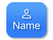
The shadow style works well with SF symbols. For example, applying a shadow to both the foreground and background styles:
VStack {
  Image(systemName: "person")
  Text("Name")
}
.background(in: RoundedRectangle(cornerRadius: 2).inset(by: -10))
.backgroundStyle(.blue.gradient
  .shadow(.drop(radius: 1, x: 2, y: 2)))
.foregroundStyle(.white
  .shadow(.drop(radius: 1, x: 2, y: 2)))
Animating Changes
The gradient and shadow effects are animatable when changed. Let’s build an “On Air” indicator that switches between off/on states:
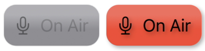
I built the view with an HStack in a rounded rectangle:
struct OnAirView: View {
  @Binding var onAir: Bool

  var body: some View {
    HStack {
      Image(systemName: "mic")
      Text("On Air")
    }
    .background(in: RoundedRectangle(cornerRadius: 2)
      .inset(by: -10))
    .backgroundStyle(onAir ? onBackground : offBackground)
    .foregroundStyle(onAir ? onForeground : offForeground)
  }
}
I switch the background and foreground styles depending on the onAir state. I find it easiest to define those styles as separate properties. First the background styles:
private let offBackground: AnyShapeStyle = AnyShapeStyle(
  .gray.gradient
  .shadow(.drop(radius: 0)))

private let onBackground: AnyShapeStyle = AnyShapeStyle(
  .red.gradient
  .shadow(.drop(radius: 2, x: 2, y: 2)))
This switches between a gray gradient with no drop shadow (radius 0) and a red gradient with a drop shadow. It’s better to remove the shadow by applying a zero radius rather than omit it to avoid a harsh animation.
The foreground styles used for the text and symbol follow a similar pattern:
private let offForeground: AnyShapeStyle = AnyShapeStyle(
  .black.opacity(0.4)
  .shadow(.drop(radius: 0)))

private let onForeground: AnyShapeStyle = AnyShapeStyle(
  .black.opacity(1)
  .shadow(.drop(radius: 2, x: 2, y: 2)))