The speedometer style gauge view has long been a feature of watchOS complications. In iOS 16, macOS 13 and watchOS 9, Apple introduced a gauge view that work across all three platforms.
Note: Apple deprecated the ClockKit gauges in watchOS 9.
Gauge View
You use a Gauge view to show a value within a closed range. By default, the range is 0…1. The value must conform to BinaryFloatingPoint so a Double or Float work fine:
struct Speedometer: View {
  @State private var speed = 0.75

  var body: some View {
    Gauge(value: speed) {
      Text("Speed")
    }
  }
}
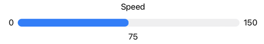
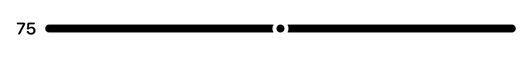
The label is a view that describes the gauge’s purpose. The default gauge style depends on the context but, at least on iOS, you get a linear capacity gauge:

A value of 0.75 fills 75% of the track using the default range.
Using A Range
If you don’t want to map your value into the default 0…1 range you can set your own bounds:
struct Speedometer: View {
  @State private var currentSpeed = 75.0
  private let minSpeed = 0.0
  private let maxSpeed = 150.0

  var body: some View {
    Gauge(value: currentSpeed, in: minSpeed...maxSpeed) {
      Text("Speed")
    }
  }
}
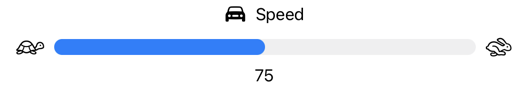
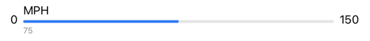
A value of 75.0 fills 50% of the track using a range of 0…150:

Adding Custom Labels
You can supply views for the current value, and optionally a minimum value and maximum value:
Gauge(value: currentSpeed, in: minSpeed...maxSpeed) {
  Text("Speed")
} currentValueLabel: {
  Text(currentSpeed.formatted())
} minimumValueLabel: {
  Text(minSpeed.formatted())
} maximumValueLabel: {
  Text(maxSpeed.formatted())
}
All four labels are views so we’re not restricted to plain text:
Gauge(value: currentSpeed, in: minSpeed...maxSpeed) {
  Label("Speed", systemImage: "car.fill")
} currentValueLabel: {
  Text(currentSpeed.formatted())
} minimumValueLabel: {
  Image(systemName: "tortoise")
} maximumValueLabel: {
  Image(systemName: "hare")
}
Note that the bounds views (minimumValueLabel and maximumValueLabel) must be the same type.
We can apply the usual view modifiers to any of the views:
Gauge(value: currentSpeed, in: minSpeed...maxSpeed) {
Label("Speed", systemImage: "gauge")
} currentValueLabel: {
Text(currentSpeed.formatted())
} minimumValueLabel: {
Image(systemName: "tortoise")
.foregroundColor(.green)
} maximumValueLabel: {
Image(systemName: "hare")
.foregroundColor(.red)
}
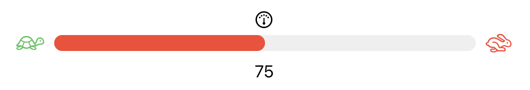
.tint(currentSpeed > speedLimit ? .red : .green)
.labelStyle(.iconOnly)
Gauge Styles
Use the .gaugeStyle modifier to change the gauge style.
The default on iOS is the .linearCapacity style that you can see above. There are also some accessory styles available for iOS, macOS and watchOS. These are suitable for use in the new in iOS 16 lock screen widgets.
Notes:
- There are two extra styles,
circularandlinear, that are only supported on watchOS 7+. They are not available for iOS or macOS. - Not all styles show all four labels, but they are still used for accessibility.
accessoryLinear
A more compact version, without the description label, of the linear style with a marker that indicates the current value.
Gauge(value: currentSpeed, in: minSpeed...maxSpeed) {
  Text("MPH")
} currentValueLabel: {
    Text(currentSpeed.formatted())
} minimumValueLabel: {
    Text(minSpeed.formatted())
} maximumValueLabel: {
    Text(maxSpeed.formatted())
}
.gaugeStyle(.accessoryLinear)
If you include the bounds labels the gauge shows them on the leading and trailing edges, otherwise it shows the current value label on the leading edge:
accessoryLinearCapacity
A compact version on the linear capacity gauge with bounds labels on the leading and trailing edges. The gauge includes the label above the track and the current value label below, positioning both towards the leading edge:
Gauge(value: currentSpeed, in: minSpeed...maxSpeed) {
  Text("MPH")
} currentValueLabel: {
    Text(currentSpeed.formatted())
} minimumValueLabel: {
    Text(minSpeed.formatted())
} maximumValueLabel: {
    Text(maxSpeed.formatted())
}
.gaugeStyle(.accessoryLinearCapacity)
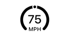
accessoryCircular
A compact circular gauge with an open ring and a marker. The gauge shows the current value label in the center and the gauge label in the opening at the bottom of the ring:
Gauge(value: currentSpeed, in: minSpeed...maxSpeed) {
  Text("MPH")
} currentValueLabel: {
    Text(currentSpeed.formatted())
}
.gaugeStyle(.accessoryCircular)
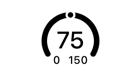
If you include the bounds labels the gauge shows them instead of the description label:
accessoryCircularCapacity
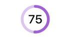
A closed ring version of the circular gauge with the ring filled to indicate the current value:
Gauge(value: currentSpeed, in: minSpeed...maxSpeed) {
  Text("MPH")
} currentValueLabel: {
  Text(currentSpeed.formatted())
}
.gaugeStyle(.accessoryCircularCapacity)
.tint(.purple)
This style doesn’t show the bounds or gauge label but as mentioned before you should consider including them for accessibility.