SwiftUI has lots of ways to create rounded rectangles but what if you want to match the corner radius of a widget? Apple added ContainerRelativeShape to iOS 14 for that purpose.
The Apple Human Interface Guidelines for widgets suggests you coordinate the corner radius of your content with the corner radius of the widget:
To ensure that your content looks good within a widget’s rounded corners, use a SwiftUI container to apply the correct corner radius.
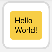
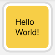
That’s hard to do yourself. Here’s my starting point. A widget view that has a single text view. I’ve added some padding, background color and a corner radius:
Text("Hello World!")
  .font(.title)
  .padding()
  .background(Color.yellow)
  .cornerRadius(10)
Here’s how it looks when previewed using the small widget size:
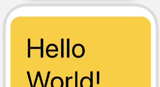
For a given content and widget size you can experiment with the corner radius until you get something that looks reasonable. It’s much harder to find a constant radius size that works across all widget sizes and for all content. For example. as my rounded content rectangle gets nearer the edges it looks a lot worse:
Container Relative Shape
Apple added ContainerRelativeShape to SwiftUI in iOS 14 to make life easier for Widget developers:
A shape that is replaced by an inset version of the current container shape. If no container shape was defined, is replaced by a rectangle.
Coming back to my example, we could use it to set the background of my text view:
Text("Hello World!")
  .font(.title)
  .padding()
  .background(ContainerRelativeShape()
                .fill(Color.yellow))
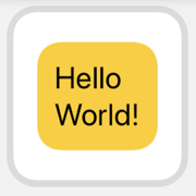
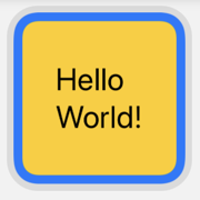
I think it works better in this case if we use the container relative shape in a ZStack. We can then use the inset(by:) modifier to control the size of the border:
ZStack {
  ContainerRelativeShape()
    .inset(by: 8)
    .fill(Color.yellow)

  Text("Hello World!")
    .font(.title)
    .padding()
}
This also makes it easier to change the border color:
ZStack {
  Color(.systemBlue)

  ContainerRelativeShape()
    .inset(by: 8)
    .fill(Color.yellow)

  Text("Hello World!")
    .font(.title)
    .padding()
}
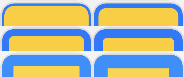
Note that the corner radius decreases as I increase the inset moving the shape further from the edges of the Widget:
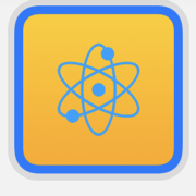
Clip Shape
You can use the container relative shape to clip an image. This works well to give an image filling the widget an even border:
ZStack {
  Color(.systemBlue)

  Image("atom")
    .resizable()
    .clipShape(ContainerRelativeShape()
               .inset(by: 8))
}