Getting to grips with SwiftUI view layout, when you’re used to UIKit, requires thinking a little different. Here’s an example where I wanted the equivalent of a UIKit stack view with an equal distribution to give views equal width. The layout must also adapt for accessibility text sizes.
A SwiftUI Layout Challenge
I’ve been practising with SwiftUI by rebuilding layouts that I’ve already built with UIKit. This has been somewhat random as I didn’t have the experience to know what would be easy and what would be difficult with SwiftUI.
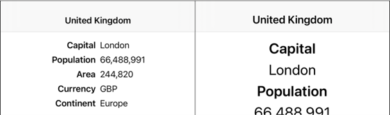
Here’s a layout that I thought would be easy showing some details about a country. I am using dynamic type:
On the left, the layout is at the default large text size and arranged as a vertical stack of horizontal rows. Each row has a field label and value positioned to the left or right of the view center.
On the right, the layout has adapted to a larger text size by arranging each row vertically. As the text size increases the whole view has to scroll.
Building With UIKit
This is familiar ground. A couple of stack views make short work of this layout:
- Each row has a horizontal stack view that contains the two labels. Importantly it uses a fill equally distribution which centers the two labels in the view.
- I embedded the horizontal stack views in a vertical stack view that has a center alignment and fill distribution.
- I embedded the vertical stack view in a scroll view pinned to the root view.
To adapt the layout when the content text size increases I implemented the traitCollectionDidChange method in the view controller. When the preferredContentSizeCategory changes to an accessibility size I switch the axis of the horizontal stack views to vertical and adjust the alignment and distribution:
for stackView in rowStackViews {
  if traitCollection.preferredContentSizeCategory.isAccessibilityCategory {
    stackView.axis = .vertical
    stackView.alignment = .center
    stackView.distribution = .fill
  } else {
    stackView.axis = .horizontal
    stackView.alignment = .fill
    stackView.distribution = .fillEqually
  }
}
I’ll skip the details for this layout as I’ve covered it several times in the past. See these posts for a recap:
You’ll also find a lot more detail on building adaptive layouts in my book Modern Auto Layout.
Building With SwiftUI
My first thought was that I could use a similar approach to build this layout with SwiftUI. They work a little different, but SwiftUI also has stack views and scroll views. Instead of a single UIStackView which you can switch between a horizontal or vertical axis we have HStack and VStack. A SwiftUI stack view has parameters for spacing and alignment but no concept of a distribution. That turns out to be a learning opportunity…
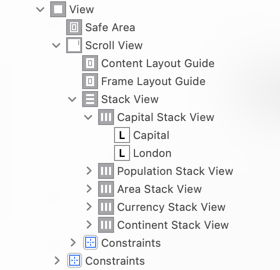
Let’s get started and see how far we can get. At the top level I know I want my country view to have rows of text that I embed in a VStack which I then embed in a scroll view. This looks a lot like the UIKit layout although a lot more concise:
struct CountryView: View {
  let country: Country

  var body: some View {
    ScrollView {
      VStack(spacing: 8.0) {
        Row(name: "Capital", value: country.capital)
        Row(name: "Population", value: country.formattedPopulation)
        Row(name: "Area", value: country.formattedArea)
        Row(name: "Currency", value: country.currency)
        Row(name: "Continent", value: country.continent)
      }
    }
    .padding()
    .navigationBarTitle(Text(country.name), displayMode: .inline)
  }
}
The Row view is a HStack with the two text labels (we’ll ignore adapting the layout for the moment):
private struct Row: View {
  let name: String
  let value: String?

  var body: some View {
    HStack(spacing: 8.0) {
      Text(name)
        .font(.headline)
      Text(value ?? "")
        .font(.body)
    }
  }
}
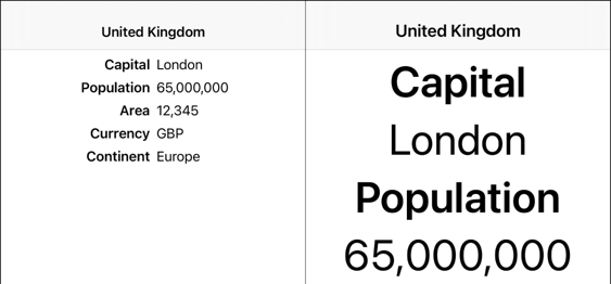
The text alignment of the rows is wrong but this is not a bad start:
How can we fix the alignment of those text labels?
What’s Happening?
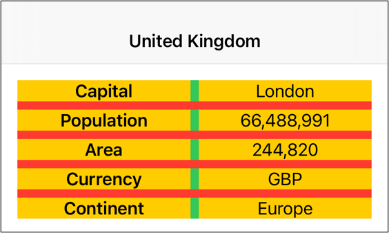
The UIKit layout works by first pinning the vertical stack to the full size of the root scroll view and then centering its content. The horizontal stack view for each row uses a fill equally distribution which makes both text labels the same size ensuring all rows end up vertically aligned around the center.
To understand what is happening I’ve added yellow backgrounds to the labels, green to the horizontal row stacks and red to the vertical stack view:
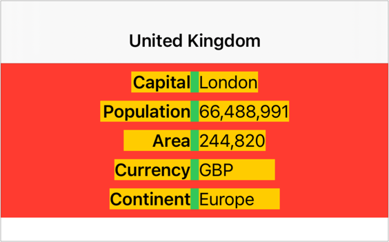
Note how the width of the two labels in each row are set for the widest of the two labels. By making both labels the same size we ensure the alignment is always the same. Compare this to the SwiftUI layout using the same color scheme:
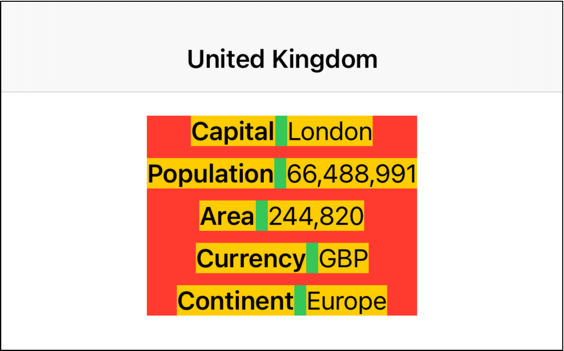
As SwiftUI works its way down the view hierarchy it offers each view the available space. Since the scroll view and the two stack views are containers the width of the views ends up being set by the size of the text views, spacing and padding.
-
Each text view takes the space needed to contain its text. The width of the two text views together with the spacing fixes the width of the horizontal stack view.
-
The vertical stack view gets a width sufficient to contain the widest of its child horizontal stack views. In this case it’s the population row that is the widest row.
-
The vertical stack view, by default, horizontally centers the horizontal stacks in its frame. Since they are all of different widths the green spacing ends up vertically misaligned.
Flexible Frames
Since a SwiftUI HStack doesn’t have the concept of a fill equally distribution we need another way to make two views have equal width. My first attempts involved using geometry readers to measure the width of the text views and somehow use that to set the width of the vertical stack. That was an exercise in frustration.
An easier way is to embed each text view in an extra frame which can constrain the size and position of the view. In SwiftUI, you do that by adding a flexible frame around each text view:
HStack(spacing: 8.0) {
  Text(name)
    .font(.headline)
    .frame(maxWidth: .infinity)
  Text(value ?? "")
    .font(.body)
    .frame(maxWidth: .infinity)
}
This was not obvious to me, perhaps because using a frame was always something to avoid with Auto Layout. A flexible frame takes a long list of parameters to set a minimum, ideal and maximum width and height. All of these parameters have default values. In my example I’ve set a maximum width of .infinity which means the frame wants to be as big as possible.
When SwiftUI lays out the HStack it does so by dividing the available space, minus the spacing, by the number of children. It then proposes that space to each child starting with the “least flexible”.
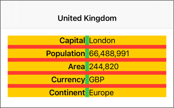
The HStack has two children (the frames) that both want to be as big as possible so it divides the available space equally between them. The frames then propose this size to their child text view. The text view takes the width it needs (wrapping if needed) and is centered within its containing frame:
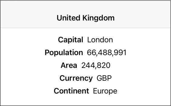
This is almost what I want. The final piece is to change the default center positioning of the frame to use either leading or trailing alignments:
HStack(spacing: 8.0) {
  Text(name)
    .font(.headline)
    .frame(maxWidth: .infinity, alignment: .trailing)
  Text(value ?? "")
    .font(.body)
    .frame(maxWidth: .infinity, alignment: .leading)
}
Adaptive Stack View
How do we make this adapt when the dynamic type size changes? To detect the change in size we can make use of the SwiftUI built-in environment property which gives us the text size category:
@Environment(\.sizeCategory) var sizeCategory
We can then switch between VStack and HStack when the user chooses an accessibility text size. SwiftUI takes care of automatically updating the view for us when the size category changes:
private struct Row: View {
  let name: String
  let value: String?

  @Environment(\.sizeCategory) var sizeCategory

  var body: some View {
    if sizeCategory.isAccessibilityCategory {
      VStack(spacing: 8.0) {
        Text(name)
          .font(.headline)
        Text(value ?? "")
          .font(.body)
      }
    } else {
      HStack(spacing: 8.0) {
        Text(name)
          .font(.headline)
          .frame(maxWidth: .infinity, alignment: .trailing)
        Text(value ?? "")
          .font(.body)
          .frame(maxWidth: .infinity, alignment: .leading)
      }
    }
  }
}
There’s a few minor adjustments I could make for the padding and alignment of the text when it wraps over multiple lines but this is close enough: