The 2020 iPhone release brings us four new models with three new device sizes including a 5.4" mini. Here’s a recap of what you need to know to update your Apps for the new devices.
Last updated: Oct 12, 2022
The New Models In A Nutshell
The four new devices all follow the iPhone X style of having no home button and a cutout or notch for the camera and sensor housing.
iPhone 12
- Display: 6.1" Super Retina XDR (OLED)
- Screen resolution (points): 390 x 844
- Native resolution (pixels): 1170 x 2532 (460 ppi)
- Native Scale factor: 3x
- Portrait size classes: w: Compact, h: Regular
- Landscape size classes: w: Compact, h: Compact
iPhone 12 mini
- Display: 5.4" Super Retina XDR (OLED)
- Screen resolution (points): 375 x 812
- Native resolution (pixels): 1080 x 2340
- Native Scale factor: 2.88x
- Portrait size classes: w: Compact, h: Regular
- Landscape size classes: w: Compact, h: Compact
Notes:
- This year Apple has given the two lower cost iPhones the same Super Retina XDR (OLED) display technology as the higher cost Pro models. Previously the iPhone 11 had a lower resolution Liquid Retina HD (LCD) display compared to the iPhone 11 Pro.
iPhone 12 Pro
- Display: 6.1" Super Retina XDR (OLED)
- Screen resolution (points): 390 x 844
- Native resolution (pixels): 1170 x 2532 (460 ppi)
- Scale factor: 3x
- Portrait size classes: w: Compact, h: Regular
- Landscape size classes: w: Compact, h: Compact
iPhone 12 Pro Max
- Display: 6.7" Super Retina XDR (OLED)
- Screen resolution (points): 428 x 926
- Native resolution (pixels): 1284 x 2778 (458 ppi)
- Scale factor: 3x
- Portrait size classes: w: Compact, h: Regular
- Landscape size classes: w: Regular, h: Compact
Notes:
-
The iPhone 12 Pro shares the same 6.1" screen size and resolution as the iPhone 12.
-
The iPhone 12 Pro Max follows the pattern of other Plus and Max models by having a regular width size class in landscape.
-
It’s recommended to submit an update built with Xcode 12.1 so your apps are correctly sized on the new devices.
Safe Area Insets - Mind the Gap
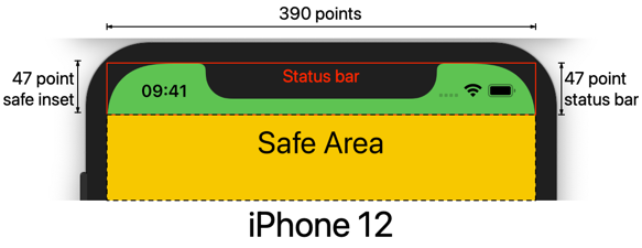
There’s one more curiosity with the iPhone 12 mini. The safe area inset at the top of the device is slightly larger than the height of the status bar. For comparison, here is the iPhone 12. The status bar is 47 points high which matches the top safe area inset at 47 points. Notice how the time is more or less aligned with the bottom of the notch:

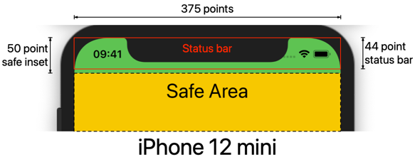
The iPhone 12 mini has a status bar that is only 44 points high - the same as the 5.8" models like the iPhone X. The difference is that the mini has a safe area top inset of 50 points:

For reasons unknown, this leaves a 6 point gap between the bottom of the status bar and the top of the safe area. I should say this all based on the simulator so it will be interesting to confirm when someone has a physical device.
A Growing List of iPhones (and an iPod)
By my count there are now twenty iOS devices that support a minimum deployment target of iOS 13 (I’m not counting the iPad here but I am including the 4" iPod touch which you can still buy in 2020):
-
6.7" (428 x 926 points @3x)
iPhone 12 Pro Max -
6.5" (414 x 896 points @3x)
iPhone 11 Pro Max, iPhone XS Max -
6.1" (390 x 844 points @3x)
iPhone 12 Pro, iPhone 12 -
6.1" (414 x 896 points @2x)
iPhone 11, iPhone XR -
5.8" (375 x 812 points @3x)
iPhone 11 Pro, iPhone XS, iPhone X -
5.5" (414 x 736 points @3x)
iPhone 8 Plus, iPhone 7 Plus, iPhone 6S Plus -
5.4" (375 x 812 points @3x)
iPhone 12 mini -
4.7" (375 x 667 points @2x)
iPhone SE (2nd Gen), iPhone 8, iPhone 7, iPhone 6S -
4" (320 x 568 @2x)
iPhone SE (1st Gen), iPod Touch (7th Gen)
App Store Screenshots
At the time of writing, the screenshot requirements in App Store Connect have not changed for the new device sizes. This means you still need at least a 6.5" (1242 x 2688 pixel) and a 5.5" (1242 x 2208 pixel) screenshot which are then scaled for the remaining sizes you don’t supply.
Want To Learn More?
If you’re struggling to build layouts that work across the growing range of iOS devices you might like my book - Modern Auto Layout.