Is this the beginning of the end for UITableView? Here’s my guide to building table-view like lists using collection views with iOS 14. Along the way we’ll also look at the new way to manage cell configurations and make use of a diffable data source.
Start with a Collection View
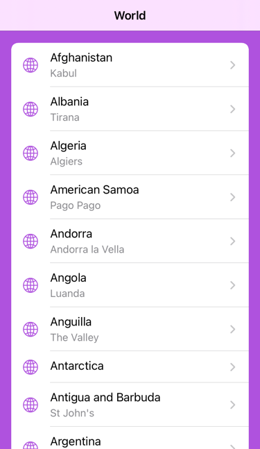
My target interface shows a list of countries. This is the sort of interface that you would traditionally build with a UITableView:

I’m using a standard UICollectionViewController created in a storyboard but you can just as easily create it programmatically. I do the interesting configuration in code. Here’s what my view controller looks like:
// ListController.swift
import UIKit
final class ListController: UICollectionViewController {
    var countries = [Country]()
}
The Country model object is a plain old Swift struct:
struct Country {
    var name: String
    var capital: String?
    ...
}
I’ll skip the details here but I populate the view controller with a set of country data in the scene delegate.
Collection View List Layout
My list has a single section so configuring a collection view with a list style layout takes only a couple of steps (I call this from viewDidLoad):
var config = UICollectionLayoutListConfiguration(appearance:
  .insetGrouped)
config.backgroundColor = .systemPurple
collectionView.collectionViewLayout =
  UICollectionViewCompositionalLayout.list(using: config)
This first creates a list configuration and then uses it to create a list style compositional layout for the collection view. You can change the background color, whether it has headers/footers, and if it shows separators:
config.backgroundColor = .systemPurple
// config.headerMode = .firstItemInSection
// config.footerMode = .supplementary
// config.showsSeparators = false
Note: My table view replacement doesn’t need it but compositional layout allows you to get a lot more fancy and have different layouts per section.
List appearance
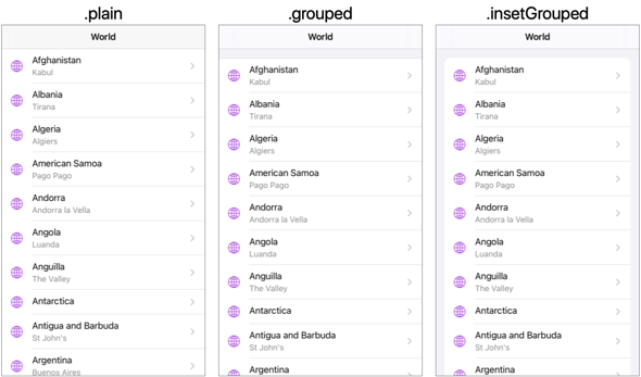
Creating a layout list configuration requires you to choose an appearance. The .plain, .grouped and .insetGrouped appearances match the styles of UITableView:

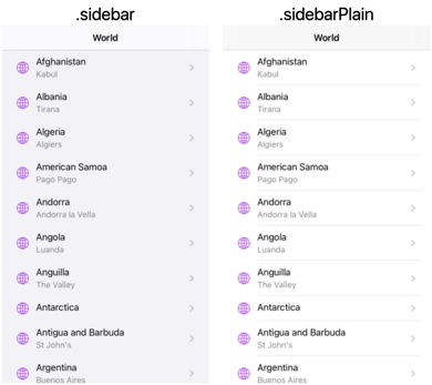
The .sidebar and .sidebarPlain appearances are new iOS 14 styles for presenting lists as sidebars (typically when acting as the primary view in a split view):

We’ll look at how cell management has changed in iOS 14 but first we need a data source.
Diffable Data Source
Apple introduced the diffable data source in iOS 13. Here’s a quick recap in case they are new to you.
We need a data source to populate our list layout. A traditional table or collection view data source relied on you providing methods that answered at least these questions:
- the number of sections
- the number of items in each section
- the cell for the item at each index path (section, row)
This resulted in a lot of boilerplate code and was error prone when dealing with batch updates. Apple introduced diffable data sources in iOS 13. They are generic for the section identifier type and the item identifier type where both identifiers must be hashable:
UICollectionViewDiffableDataSource<SectionIdentifierType, ItemIdentifierType>
A common approach for the section identifier is to use an enum. We only have a single section in our example:
private enum Section: CaseIterable {
    case main
}
My Country struct is a simple value type so we can use it directly as the item identifier type as long as we make it hashable:
struct Country: Hashable { ... }
If your model type has an obvious identifier like a UUID you could also use that. In this case I’m going to use the Country so our data source type becomes:
UICollectionViewDiffableDataSource<Section, Country>
To create our data source we need a closure that dequeues and populates cells:
let dataSource = UICollectionViewDiffableDataSource<Section, Country>(collectionView: collectionView)
  { (collectionView, indexPath, country) -> UICollectionViewCell? in
    // dequeue and populate cell with item identified
    // by country
  }
In iOS 13, you either created your cell in a storyboard or registered a cell class or nib file. You then dequeued the cell using a reuse identifier. In iOS 14 we have the option to register and use a cell configuration.
Modern Cell Configuration
A big change in iOS 14 is the introduction of cell configurations that describe the appearance of the cell for a specific state. You no longer directly configure a cell, instead you apply the configuration to the cell. The same approach works for both UITableViewCell and UICollectionViewCell.
A cell can have both a background and content configuration. The UIListContentConfiguration type has pre-defined configurations covering the common UITableViewCell styles:
UIListContentConfiguration.cell()
UIListContentConfiguration.subtitleCell()
UIListContentConfiguration.valueCell()
UIListContentConfiguration.sidebarCell()
UIListContentConfiguration.plainHeader()
UIListContentConfiguration.groupedFooter()
In practise you can also ask the cell you are configuring to give you a default configuration for the list style and environment:
var content = cell.defaultContentConfiguration()
These cell configurations are self-sizing by default and adapt to the environment (dynamic type size, dark mode, etc.). The configuration has properties for text and an image much like UITableViewCell, but note these are not views:
content.text = "Title"   // there's also an attributedText
content.secondaryText = "Subtitle"
content.image = UIImage(...)
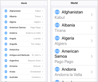
Here’s an example of a valueCell at two different dynamic type sizes. Notice how the text switches from a horizontal to a vertical layout:

You can control this behavior with a configuration property:
// cell is now more like a subtitle style
content.prefersSideBySideTextAndSecondaryText = false
You can adjust the padding and the layout margins (there’s no setting to follow the readable content guide):
content.imageToTextPadding = 4
content.textToSecondaryTextVerticalPadding = 8
content.textToSecondaryTextHorizontalPadding = 8
content.directionalLayoutMargins = NSDirectionalEdgeInsets(...)
Since we no longer directly work with a UILabel or UIImageView the configuration has properties you can adjust:
content.textProperties.color = .systemRed
content.secondaryTextProperties.font = UIFont.preferredFont(forTextStyle: .subheadline)
content.imageProperties.tintColor = .systemPurple
The cell appearance does not change until you apply the configuration to cell:
cell.contentConfiguration = content
You can still use your own custom cell layout but that’s a story for another day.
Creating the data source
Let’s walk through the steps to add a diffable data source to our view controller using the new cell configuration. I’m using a lazy property for the data source:
private lazy var dataSource: UICollectionViewDiffableDataSource<Section, Country> = {
First we need to create a cell registration for our cell type (UICollectionViewListCell) that returns a configured cell:
  let cellRegistration = UICollectionView.CellRegistration<UICollectionViewListCell, Country>
  { cell, indexPath, country in
The registration gives us a closure with the cell, indexPath and identifier of the item (which in this case is also the item). I start with a clean default content configuration:
var content = cell.defaultContentConfiguration()
Set the main and secondary text properties and change the default color and font of the secondary text:
  content.text = country.name
  content.secondaryText = country.capital
  content.secondaryTextProperties.color = .secondaryLabel
  content.secondaryTextProperties.font = UIFont.preferredFont(forTextStyle: .subheadline)
Add a symbol for the image and change the font to match the primary text:
  content.image = UIImage(systemName: "globe")
  content.imageProperties.preferredSymbolConfiguration =
    .init(font: content.textProperties.font, scale: .large)
Now we apply the content configuration to the cell:
cell.contentConfiguration = content
I’ll also set the cell accessories and cell tint color:
  cell.accessories = [.disclosureIndicator()]
  cell.tintColor = .systemPurple
}
Finally we can return the data source using the cell registration to configure the dequeued cell:
  return UICollectionViewDiffableDataSource<Section, Country>(collectionView: collectionView)
  { (collectionView, indexPath, country) -> UICollectionViewCell? in
    return collectionView.dequeueConfiguredReusableCell(using:
      cellRegistration, for: indexPath, item: country)
  }
}()
Reuse identifiers are not required. I should point out you can use cell configurations without having to use a diffable data source.
Snapshots
To populate the collection view we create and apply snapshots to the data source:
private func applySnapshot(animatingDifferences: Bool = true) {
  var snapshot = NSDiffableDataSourceSnapshot<Section, Country>()
  snapshot.appendSections(Section.allCases)
  snapshot.appendItems(countries)
  dataSource.apply(snapshot, animatingDifferences: animatingDifferences)
}
Note that the snapshot is generic for the section and item identifier types. I first append the sections to the new snapshot. Appending the items adds them to the last section which is our single main section. I apply the snapshot in viewDidLoad and when my country data changes (animating any changes for the latter):
var countries = [Country]() {
    didSet {
        applySnapshot()
    }
}

override func viewDidLoad() {
    super.viewDidLoad()
    createLayout()
    applySnapshot(animatingDifferences: false)
}
Sample Code
That’s a lot of words for something that ends up with not much code. You can find the full ListCollection sample project in my GitHub Code Examples repository. It needs Xcode 12 and iOS 14.
See Also
I found these WWDC 2020 sessions useful if you want to dig deeper:
For a recap on diffable data sources and snapshots, see this session from WWDC 2019: