Apple gave buttons a big upgrade in iOS 15. You now create and update button configurations much like the changes Apple introduced for collection and table view cells in iOS 14.
Four Basic Styles
Starting in Xcode 13, there are four basic pre-defined styles for a button. When you drag a button from the object library onto the Interface Builder canvas it has a plain style. Use the attributes inspector to select one of the other styles:
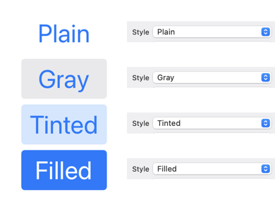
If you’re supporting iOS 14 or earlier you’ll need to change the button style to “Default”. You can then further customize the button configuration in the attributes inspector or in code.
Button Configurations
If you’re creating your buttons in code the, new in iOS 15, button configuration replaces many of the old methods and properties of UIButton: You can set the configuration directly on the button:
let button = UIButton(type: .system)
button.configuration = .plain()
button.configuration = .gray()
button.configuration = .tinted()
button.configuration = .filled()
To customize one of the predefined configurations, first make a copy:
var config = UIButton.Configuration.filled()
config.title = "Custom Filled Button"
...
button.configuration = config
If you’ve adopted the UIAction closure based actions from iOS 13, pass the configuration when creating the button:
let button = UIButton(configuration: config,
  primaryAction: UIAction() { _ in
    print("Go")
   })
Customizing The Button
When customizing the button you change the configuration rather than setting properties directly on the button. Let’s look at some of the options:
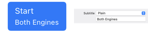
Titles and Subtitles
The button title and subtitle can be plain text or attributed strings:
var config = UIButton.Configuration.filled()
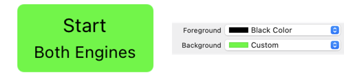
config.title = "Start"
config.subtitle = "Both Engines"
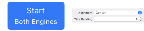
If you’re using a subtitle you can change the alignment with and the padding to the title:
config.titleAlignment = .center
config.titlePadding = 4.0
Button Colors
You can set the base background and foreground color of the button. The button may change these base colors when in different states (for example when highlighted):
config.baseBackgroundColor = .green
config.baseForegroundColor = .black
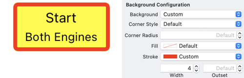
For greater control of the background, UIButton supports the UIBackgroundConfiguration introduced in iOS 14 for table and collection view cells:
config.background.backgroundColor = .systemYellow
config.background.strokeColor = .systemRed
config.background.strokeWidth = 4.0
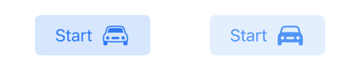
Corner Style
The default corner style is dynamic which adjust the corner radius for the dynamic type size. You can also choose fixed, small, medium, large and capsule:
config.cornerStyle = .capsule
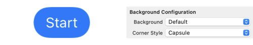
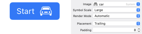
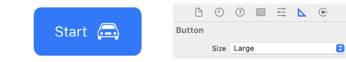
Image Placement
When you add a foreground image to the button you can control the padding to the title, the placement (top, trailing, bottom, leading) and the symbol configuration:
config.image = UIImage(systemName: "car",
  withConfiguration: UIImage.SymbolConfiguration(scale: .large))
config.imagePlacement = .trailing
config.imagePadding = 8.0
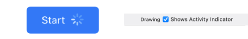
Activity Indicator
Setting the showsActivityIndicator property replaces the image with an activity indicator:
config.showsActivityIndicator = true
Button Size
You can request a preferred size for the button. Interface Builder hides this in the size inspector:
config.buttonSize = .large
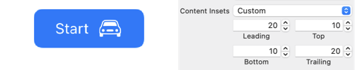
Content Insets
The content insets give you padding between the bounds of the button and the content (title and image):
config.contentInsets = NSDirectionalEdgeInsets(top: 10,
  leading: 20, bottom: 10, trailing: 20)
Configuration Update Handler
To change the appearance of the button in response to a change in state register a configuration update handler. For example, to switch between a filled and outline image when the button is in a highlighted state:
button.configurationUpdateHandler = { button in
  var config = button.configuration
  config?.image = button.isHighlighted ?
    UIImage(systemName: "car.fill") :
    UIImage(systemName: "car")
  button.configuration = config
}
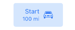
To extend the example, suppose I have a property holding the range of my car that I want to show in the button subtitle:
private var range = Measurement(value: 100,
                                 unit: UnitLength.miles)
private lazy var formatter = MeasurementFormatter()
Adding the subtitle to my configuration update handler:
button.configurationUpdateHandler = { [unowned self] button in
  var config = button.configuration
  ...
  config?.subtitle = self.formatter.string(from: self.range)
  button.configuration = config
}
Then we call setNeedsUpdateConfiguration on the button in the didSet property observer to update the subtitle whenever the range changes:
private var range = Measurement(value: 100,
  unit: UnitLength.miles) {
  didSet {
    button.setNeedsUpdateConfiguration()
  }
}