I had the good luck to get a question answered at an Apple tech talk on accessibility.
What’s the one accessibility feature, other than VoiceOver, you wish more developers knew about?
There were some good answers mentioning dynamic type, video captioning and using head tracking on the mac to control the pointer. The one that most caught my attention was from @Sommer. She answered Smart Invert, describing it as a big win for a small amount of work. Let’s find out.
What’s Smart Invert?
I knew about the accessibility feature to invert colours, but I couldn’t remember what was “smart” about Smart Invert compared to what Apple now calls “Classic Invert”. You’ll find both in the Accessibility Settings under Display & Text Size:
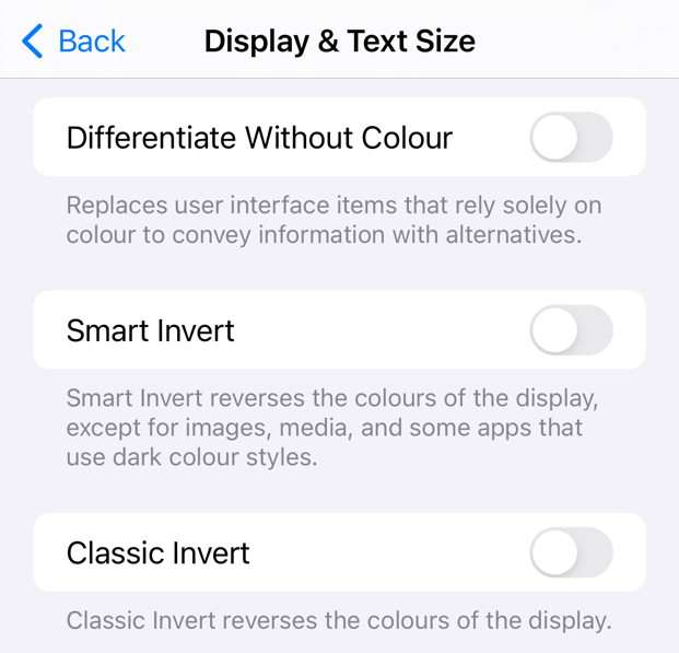
Apple demonstrated Smart Invert in the What’s New in Accessibility session back in 2017. Classic Invert changes the colors of everything regardless of the type of content. Smart Invert darkens bright, white content but should leave content like images and videos alone.
If you’re wondering why you should spend time adding support for Smart Invert take a look at the AppleVis forums. You’ll find people with a variety of vision issues where bright, mostly white, interfaces can be hard to read, distracting, or even cause blurring and headaches.
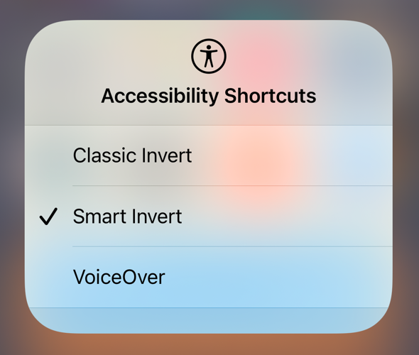
Dark mode can also help those users but classic invert, smart invert and dark mode all behave differently. Users may even switch back and forth to find what works best for them. For quick access I added classic and smart invert to my accessibility shortcuts. I can then switch between them from control center or by triple-clicking the home or top button:
How Do You Support Smart Invert?
Here’s the good news. You may not need to do much, if anything, to support smart invert. It’s a system wide setting (iOS 15 allows per-app settings) that will invert the colours in your app. You may want to do something to make sure it works well with your app.
Overriding Smart Invert
You can optionally set a flag on any view to tell Smart Invert to ignore it:
imageView.accessibilityIgnoresInvertColors = true
Setting this property on a view prevents smart invert from inverting the colours of that view and its subviews. If you’re using SwiftUI, there’s a view modifier that has the same effect:
Image("Photo")
  .accessibilityIgnoresInvertColors(true)
Check Your App
Supporting Smart Invert is a matter of turning it on and then auditing your app. Set the accessibility flag on any views you want Smart Invert to ignore. For example, here’s a screen from a test app shown with a light appearance, and then with classic and smart invert:
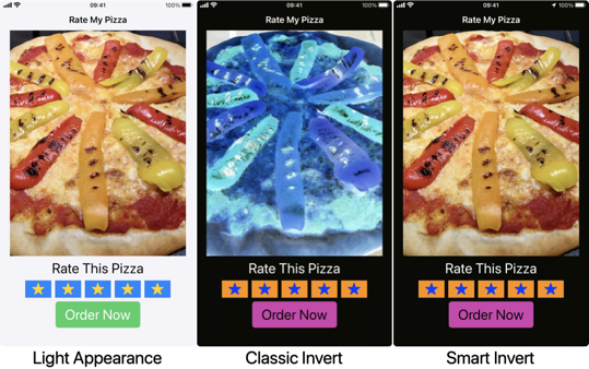
Note the difference between the classic and smart invert. To prevent Smart Invert from making the pizza blue I set the flag on the imageView:
pizzaImage.accessibilityIgnoresInvertColors = true
For comparison, this how it looks if I first switch my device to dark mode:
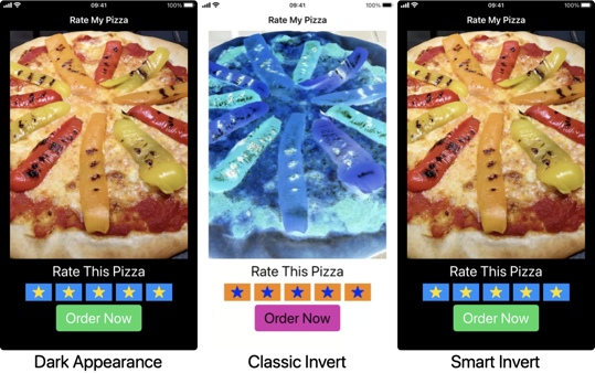
Classic Invert does not take into account the already dark interface. It inverts everything. Smart Invert is smart enough to recognise the already dark interface and leaves the colors alone.
In Summary
- Turn Smart Invert on and check your app’s user interface.
- Set
accessibilityIgnoresInvertColorson any views that Smart Invert should not touch.
I think it’s fair to say that’s a big win for a small amount of work.