I am a big fan of dynamic type. It makes me happy when I use an App that supports my preferred text size. The problem is that supporting dynamic type is extra work. In this post, I look at the iOS 12 Apple Settings screen for Larger Accessibility Sizes as a case study in how to adapt an interface to make space for dynamic type.
Last updated: Jun 12, 2020
Dealing With Large Text
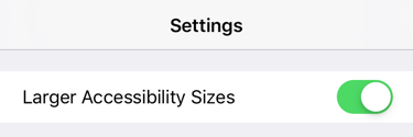
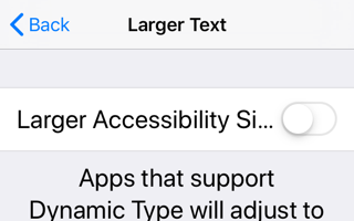
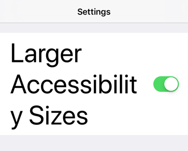
Here is the iOS 12 Apple Settings screen to enable the larger accessibility sizes, shown at the default and largest standard text sizes:
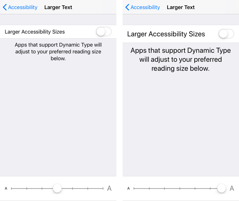
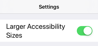
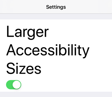
The slider at the bottom changes the preferred content size. The switch at the top allows access to the larger accessibility text sizes. Notice how the label and the switch are sharing the horizontal width. What is interesting is what happens when we enable and then use one of the larger accessibility sizes:
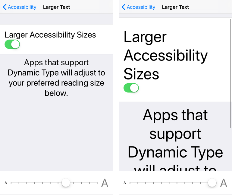
The label now gets to use the full width, and the switch drops down below the label and is pinned to the leading margin. When the text gets big, it flows over multiple-lines, and the view needs to scroll. Apple abandoned this approach in iOS 13 but let’s see if we can recreate it.
Creating The Layout
I’m only going to look at the label and the switch in this post. Here’s the view layout I came up with:
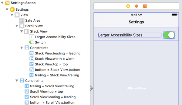
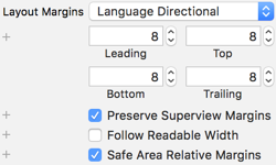
The label and switch are in a horizontal stack view with a .fill distribution. I embedded the stack view in a scroll view which I pinned to the edges of the root view. I also gave the stack view an 8pt (safe area relative) margin and made it and the scroll view preserve superview margins:
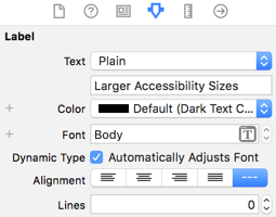
The label is using the Body text style and is set to automatically adjust when the user changes their preferred size (needs a minimum of iOS 10):
I also added a white stack view background view in the view controller. Here is how it looks on an iPhone 8 at the default text size:
Even Apple Makes Mistakes
Before we look at adapting the layout for accessibility text sizes, we need to take care of another potential issue. What happens if our text label gets too wide to fit in the available horizontal space?
This is easy to forget which can lead to some runtime embarrassment. Here is the Apple Settings App running on the narrow iPhone SE (simulator):
The label is truncated at the larger text sizes when it should wrap over multiple lines. To avoid this mistake:
- Set the number of lines for the label to zero.
- Make sure the label has a lower horizontal compression resistance priority than the switch.
The switch and label have default compression resistance priorities of 750. I changed the label to 250 to make sure it gets squeezed when it grows too wide. I should mention I also had to increase the content hugging priority of the switch to 761 to work around an annoying stack view feature/bug. Our label now wraps on narrow screens:
Detecting Accessibility Text Sizes
At the larger accessibility sizes keeping the label and switch arranged horizontally becomes cramped:
To give the text as much space as possible we can move the switch down below the label when the user selects one of the large accessibility sizes. How do we do that?
We could observe the content size category did change notification, but since iOS 10 I think there is a better way using trait collections.
In iOS 10 the UITraitCollection class got a property for the preferred content size category. This means we can implement the traitCollectionDidChange method in our view controller to find out when it changes:
override func traitCollectionDidChange(_ previousTraitCollection: UITraitCollection?) {
  super.traitCollectionDidChange(previousTraitCollection)
  if previousTraitCollection?.preferredContentSizeCategory != traitCollection.preferredContentSizeCategory {
    configureView(for: traitCollection)
  }
}
You must always call the super implementation first then we check to see if the preferred content size category has changed. If it has we reconfigure the view based on the current trait collection:
private func configureView(for traitCollection: UITraitCollection) {
  let contentSize = traitCollection.preferredContentSizeCategory
  if contentSize.isAccessibilityCategory {
    stackView.axis = .vertical
    stackView.alignment = .leading
  } else {
    stackView.axis = .horizontal
    stackView.alignment = .center
  }
}
To check if the user has switched to a large accessibility text size, we get the current size from the trait collection. The UIContentSizeCategory structure has a convenient instance property to let us test for accessibility sizes:
var isAccessibilityCategory: Bool { get }
If the user has chosen an accessibility size, we reconfigure the stack view to a vertical axis and change the alignment to leading. Otherwise, we use the horizontal axis with a center alignment.
Starting with iOS 13, the system predicts size classes when loading views so we may not get an initial call to traitCollectionDidChange. We allow for that by always configuring the initial state of the stack view:
override func viewDidLoad() {
  ...
  configureView(for: traitCollection)
}
Here’s how it looks on an iPhone 8 at the largest accessibility size:
Get The Code
You can find the code for this post in my GitHub CodeExamples repository.
Want To Learn More?
If you enjoyed this post and want to learn more about using Dynamic Type and Auto Layout, you should get my book - Modern Auto Layout.