Since Xcode 12 you can add your own custom SwiftUI views and modifiers to the Xcode Library. Here’s my quick summary of how it works.
Xcode Library
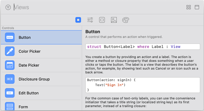
The Xcode Library provides you a way to browse the available SwiftUI views and modifiers. You can drag views and modifiers from the library into the canvas or directly into your SwiftUI source code:
In Xcode 11, the library only shows the standard Apple supplied views and modifiers. Xcode 12 allows us to add our own custom views and modifiers to the library.
Adding Custom Views
Let’s start with custom SwiftUI views (this will not work with UIKit views). Here’s my attempt at an adaptive stack view that switches between vertical or horizontal stack layouts depending on the size class and accessibility category:
struct AdaptiveStack<Content: View>: View {
  @Environment(\.sizeCategory) var sizeCategory
  @Environment(\.horizontalSizeClass) var horizontalSizeClass

  private var compactDesign: Bool {
    sizeCategory.isAccessibilityCategory ||
    horizontalSizeClass == UserInterfaceSizeClass.compact
  }

  private var horizontalAlignment: HorizontalAlignment
  private var verticalAlignment: VerticalAlignment
  private var spacing: CGFloat?
  private var content: Content

  init(horizontalAlignment: HorizontalAlignment = .center,
    verticalAlignment: VerticalAlignment = .center,
    spacing: CGFloat? = nil,
    @ViewBuilder content: () -> Content) {
      self.horizontalAlignment = horizontalAlignment
      self.verticalAlignment = verticalAlignment
      self.spacing = spacing
      self.content = content()
  }

  var body: some View {
    if compactDesign {
      VStack(alignment: horizontalAlignment, spacing: spacing) { content }
    } else {
      HStack(alignment: verticalAlignment, spacing: spacing) { content }
    }
  }
}
To make this custom view show up in the Xcode Library we need to create a Library Content Provider. This is similar to creating a preview provider. Use the Xcode menu Editor > Create Library Item if you need a reminder of the syntax:
struct AdaptiveStackLibrary: LibraryContentProvider {
  var views: [LibraryItem] {
    LibraryItem(AdaptiveStack {
      Text("Hello")
    }, category: .layout, matchingSignature: "asv")
}
The LibraryContentProvider protocol has a views property which is an array of LibraryItem. The protocol adds the @LibraryContentBuilder attribute when defining the views parameter:
@LibraryContentBuilder var views: [LibraryItem] { get }
Like a ViewBuilder, this allows us to build an array of LibraryItem without using the array syntax so we can skip the square brackets and comma separators. The LibraryItem has a number of properties:
- snippet The code expression to insert.
- visible Set to
falseto hide an item in the library (if you only want the item for code completion). Defaults totrue. - title Set a title for the item or omit to have Xcode create a default title based on the name of the view.
- category The category in the library to assign to the item. Default is “Other”.
- matchingSignature An optional string that you can use to trigger code completion. The code snippet replaces the signature (but see issues below).
Any values you give for the title, category, matchingSignature or visible must be literals. You cannot use a variable.
Xcode scans your project to find the library items. This includes searching any Swift packages in the project. This means they should show up automatically in the Xcode library when you add a package with library items. I find it works most of the time (it’s not as bad as IBDesignable but it’s not perfect):
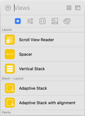
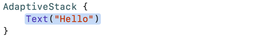
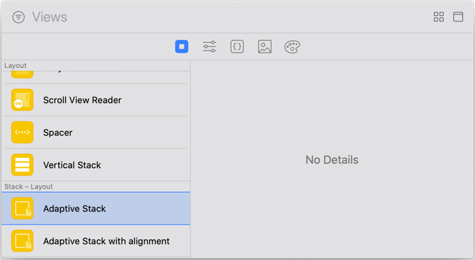
My items show up in the “Layout” section of the Views Library listed under the name of the App (“Stack” in this case). Dragging an item into the canvas or source code inserts the snippet with placeholders for the parameters:
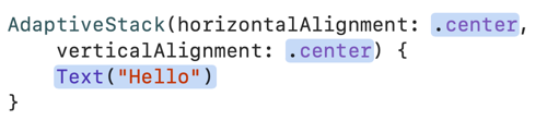
You can add more library items for the same custom view with different code snippets. For example, I added a second library item for my adaptive stack view that includes the horizontal and vertical alignment parameters. Add your own title to distinguish the two items in the library:
    LibraryItem(AdaptiveStack(horizontalAlignment: .center,
      verticalAlignment: .center) {
      Text("Hello")
    }, title: "Adaptive Stack with alignment", category: .layout)
Inserting this snippet includes the extra alignment placeholders:
View Modifiers
You follow a similar path to add library items for SwiftUI view modifiers. Here’s my modifier which adds an outer border to a view:
extension View {
  func outerBorder(padding: CGFloat, color: Color, width: CGFloat) -> some View {
    return self
      .padding(padding)
      .border(color, width: width)
  }
}
To add this to the Xcode Library we use the modifiers function of the LibraryContentProvider protocol:
struct ModifierLibrary: LibraryContentProvider {
  @LibraryContentBuilder
  func modifiers(base: Text) -> [LibraryItem] {
    LibraryItem(base.outerBorder(padding: 20.0,
      color: .black, width: 5.0), category: .effect)
  }
}
Note that this time I need to explicitly add the @LibraryContentBuilder attribute . The modifiers function takes a base argument and returns an array of LibraryItem.
The base argument is the type that the modifier applies to. If you create a modifier on a specific type use that type as the base. If your modifier is an extension on View, as in this case, you can provide any type that conforms to View.
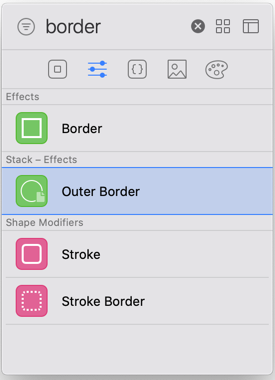
This is a bit confusing. If you use View as the base type the compiler complains because it’s not a concrete type (it’s a protocol). I used Text but it doesn’t matter what you choose. The snippet is the modifier applied to base. I placed this item in the Effects category of the Modifiers Library:
Notes and Issues
I want to like this feature, but there are a number of rough edges that make it less useful than I expected:
-
It requires iOS 14 to compile. If your project targets iOS 13 or earlier you can add an availability guard to your Library Content Providers:
@available(iOS 14.0, *)
struct AdaptiveStackLibrary: LibraryContentProvider { ... }
Unfortunately this does not help if you still need to use your custom views or modifiers with Xcode 11. This forum post has a suggestion from an Apple engineer to test for Swift 5.3:
#if swift(>=5.3) @available(iOS 14.0, *) struct AdaptiveStackLibrary: LibraryContentProvider { ... } #endif -
Adding a
matchingSignaturefor custom code completions doesn’t appear to work (FB8922520). Maybe I don’t understand how they work? Let me know if you have a working example.This is a shame as I’m finding I don’t tend to use the Xcode library much when building SwiftUI views. I prefer to add and modify views in code rather than the canvas so custom code completion would be useful.
-
The details part of the Xcode Library is empty for our custom views and modifiers (FB8922378). It would be helpful if any documentation I added to the source code showed up the way it does for Apple defined items:
Maybe Apple will fix some of these in a future Xcode release.