It is easy to forget how iOS applications looked before iOS 7. The trend for flat user interface design has mostly removed the borders, gradients and drop shadows that were once common to buttons and other controls. This minimal style can cause problems for users if you are not careful. A user may not even recognise a button if you do not make it stand out from the surrounding content.
You have probably noticed that the buttons to buy something in the App and iTunes Stores have borders. In fact this is consistent with advice from the iOS Human Interface Guidelines (my emphasis):
Embrace borderless buttons. By default, all bar buttons are borderless. In content areas, a borderless button uses context, color, and a call-to-action title to indicate interactivity. And when it makes sense, a content-area button can display a thin border or tinted background that makes it distinctive.
In this post I want to share some often overlooked features of the Asset Catalog that make it easy to add borders and tints to buttons for those times when you need to make them obvious to the user.
Buttons with Borders
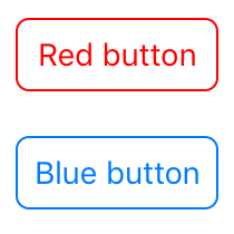
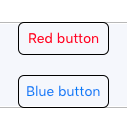
So I want a simple button with a thin rounded border matching the text color. Here are two examples:
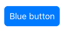
Here is the blue button when highlighted with a filled background and the title text color changed to white:
Asset Catalog to the Rescue
We will use three separate Asset Catalog techniques to create background images for our simple button design:
- PDF Vectors to create the scaled images
- Template images that display using the tintColor
- Image slicing to create resizable images to fit our buttons
I will walk through setting up the border background image. The filled image follows the same approach. To get started we needed a rounded rectangle that we can slice and stretch to our final button size. I created the border image using Graphic but any image editor will do the job:
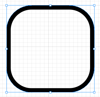
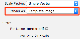
The image at 1x size is 21x21 pixels in dimension with a corner radius of 6 pixels. The color of the image does not matter as it will use the tint color when displayed.
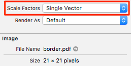
Use a PDF vector
Save the image in PDF vector format so that the asset catalog will take care of creating the 2x and 3x images for us. Check this earlier post on using PDF vector images for details. Make sure you use “Single Vector” in the attributes inspector for the Scale Factor when you add the image to the asset catalog:
Render As Template
Apple introduced Template Images in iOS 7 to make it easy to change the colour of an image to match the rest of the user interface. When you tell the system to treat an image as a template it ignores the colour of the original image and displays the image using the tintColor.
It easy to overlook but when you add an image to the asset catalog you can specify that it act as a template. In the attribute inspector change “Render As” from “Default” to “Template Image”:
We can now control the colour of our button frame by setting the tintColor property of the button.
Slice the Image
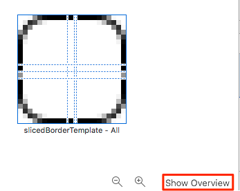
Finally to make our button backgrounds stretch to the size of the button we need to create a resizable image. I first wrote about creating resizable images back in 2012 if you are not familiar with the concept. The asset catalog interface for slicing is not exactly intuitive. You can switch between the overview and slicing interfaces using the (non-obvious) button hiding down at the bottom of the image preview:
Once you switch to the slicing view you can choose to slice the image horizontally, vertically or both ways. I find the interface painful to use and prefer to just set what I need in the attribute inspector:
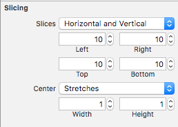
Our base image is 21x21 points so I am using 10 point end caps so the image will stretch both horizontally and vertically maintaining our 10x10 point curved end caps.
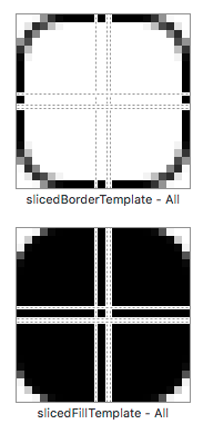
Repeating the above steps with a filled image gives me two template images in the asset catalog that I have named slicedBorderTemplate and slicedFillTemplate:
Styling the Buttons
With the asset catalog ready we can create our bordered buttons. Using Interface Builder I have two custom buttons arranged in a stack view:
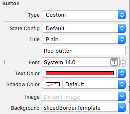
I will walk through the steps for the red button. First we set the text colour and background image for the default state of the button using the sliced border template image:
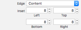
I also added an 8 point inset for some extra padding around the title label:
We set the color used to display the template image using the tint color attribute of the button. In this case we make it red overriding the application default tint:
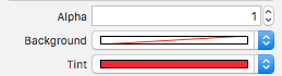
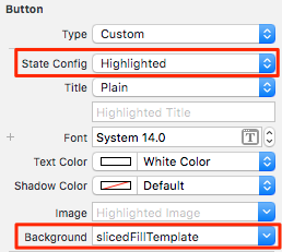
When the button is highlighted we want to use the filled template as the background image. I also changed the text to white:
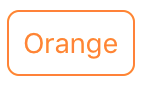
The real advantage of using template images is that we can just as easily create a blue button by repeating the above steps with different text and tint colours.
Doing it with code
If you are not using Interface Builder to create the buttons you can still make use of the asset catalog approach. Start out with a custom button (I will omit the code to set the title):
let orangeButton = UIButton(type: .Custom)
Retrieve the template images:
let slicedBorderTemplate = UIImage(named: "slicedBorderTemplate")
let slicedFillTemplate = UIImage(named: "slicedFillTemplate")
Set the button background images for the normal and highlighted states using the template images:
orangeButton.setBackgroundImage(slicedBorderTemplate, forState: .normal)
orangeButton.setBackgroundImage(slicedFillTemplate, forState: .highlighted)
Finally we set the tint color of the button used when rendering the template images:
orangeButton.tintColor = .orange
Sample Code
You can find the full working examples from this post in the Buttons Xcode project in my GitHub Code Examples repository.