I was lazy with my last post on how to use auto layout for proportional spacing. I started with three images in a horizontal row that were 120x120 points in size. Unfortunately that is too large to fit on a skinny device like the iPhone 4S. Rather than getting side-tracked with making the images adaptive I just used smaller images. That makes it fit on the smaller devices but wastes a lot of screen space on a larger iPad.
Let’s fix that now by looking at how you can dynamically adapt image sizes to different size classes.
Using the Asset Catalog with Size Classes
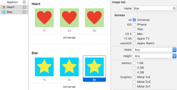
To recap I have two images sets in an asset catalog with a Universal target and 1x, 2x and 3x scale factors:
What we want is to use a larger image on an iPad which has a regular width and height but keep the smaller image in any situation with a compact width or height. I find the user interface for the asset catalog to be especially confusing. To add images for different size classes you need to look at the Width and Height fields in the Attributes Inspector:
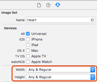
You cannot just add images for a Regular, Regular size class. The choices for both width and height are:
- Any (the default)
- Any & Compact
- Any & Regular
In general, use the default Any, Any case for the most common situation and add the exceptions. In our situation we need to add Any & Regular for both width and height to get the Regular, Regular case:
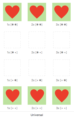
The cryptic notation under each image shows you the width (horizontal) and height (vertical) size classes that the image applies to. The key is:
*Any size class+Regular size class-Compact size class
I have added the larger 120x120 point images to the regular, regular placeholders ([+ +]) and left the other placeholders empty. You do not need to add an image for every situation. The system will use the Any, Any case for any missing combinations.
Note that we could also have solved this with iPad specific images:
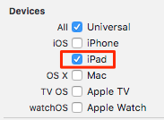
I feel like that is making unnecessary assumptions about the sizes of future Apple devices. What if they make an iPhone which has regular-regular sizes or a skinny iPad that has a compact width? Better to stick with size classes if possible.
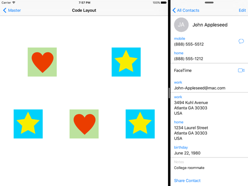
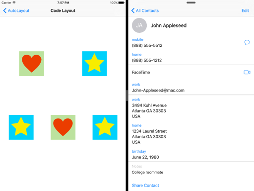
It is easy to test running on an iPad Air 2 using a split screen to switch between regular and compact horizontal size classes. The effect is maybe too subtle but hopefully you can see that the image size shrinks in the second of these two images:
The full example project is in my CodeExamples repository if you want a closer look.
Further Reading
- Customizing Image Sets for Size Classes from the Apple guide on Asset Catalogs.